Troubleshooting Tributo Simple onboarding

An audit project
Screenshot of the audit presentation slide showing categories for auditing the flow, including 'Good!' and 'Must Fix!'
Context

Tributo Simple is an accounting platform for entrepreneurs in Argentina, Uruguay y Perú. It offers a range of services, including business registration, deactivation of operations, invoicing, and payments.

The team contacted me with a crucial challenge: they needed to enhance the onboarding experience of their new launched desktop app.

To tackle this, I proposed conducting a UX audit, with the goal of identifying usability issues and improving the overall flow to ensure new users will have a smoother experience.

The timeline
Audit timeline displaying the tasks completed over 4 weeks.
Goals

The main goal for this audit was to uncover the pain points in the onboarding.

However, I also identified a secondary goal: understand what motivates users to register in the platform. This allowed me to see whether Tributo Simple was highlighting its value in the Welcome Screen and how this insights could help for future marketing assets (ads, landing pages…).

Methodology and recruitment criteria

The research utilized a combination of qualitative and quantitative methods:

  • Qualitative: usability testing with potential users who had never seen the onboarding process before.


    👤 We recruited 7 participants, all entrepreneurs, freelancers, or contractors over the age of 18. The task was simple: register for the platform.


    If you are wondering if they would actually register the app, the answer is yes but once the testing was done I’d ask if they were interested in keeping their account or not. If they would say no, I’ll write their emails in a list which after the company would delete their accounts (and of course I’d ask why).

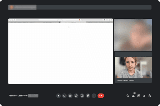
Screenshots of usability testing with user information blurred for privacy.

Sensitive information has been blurred for privacy reasons.

  • Quantitative: a survey was sent to the existing user base through Google Forms to understand motivations for onboarding. With a 16% conversion rate, we gained valuable insights for future improvements.

Key insights and hypotheses validation

From the review and audit I did myself, where I checked for usability, UI and accessibility issues, my hypothesis was that some users might abandon the onboarding because they would get lost in the verification email section.

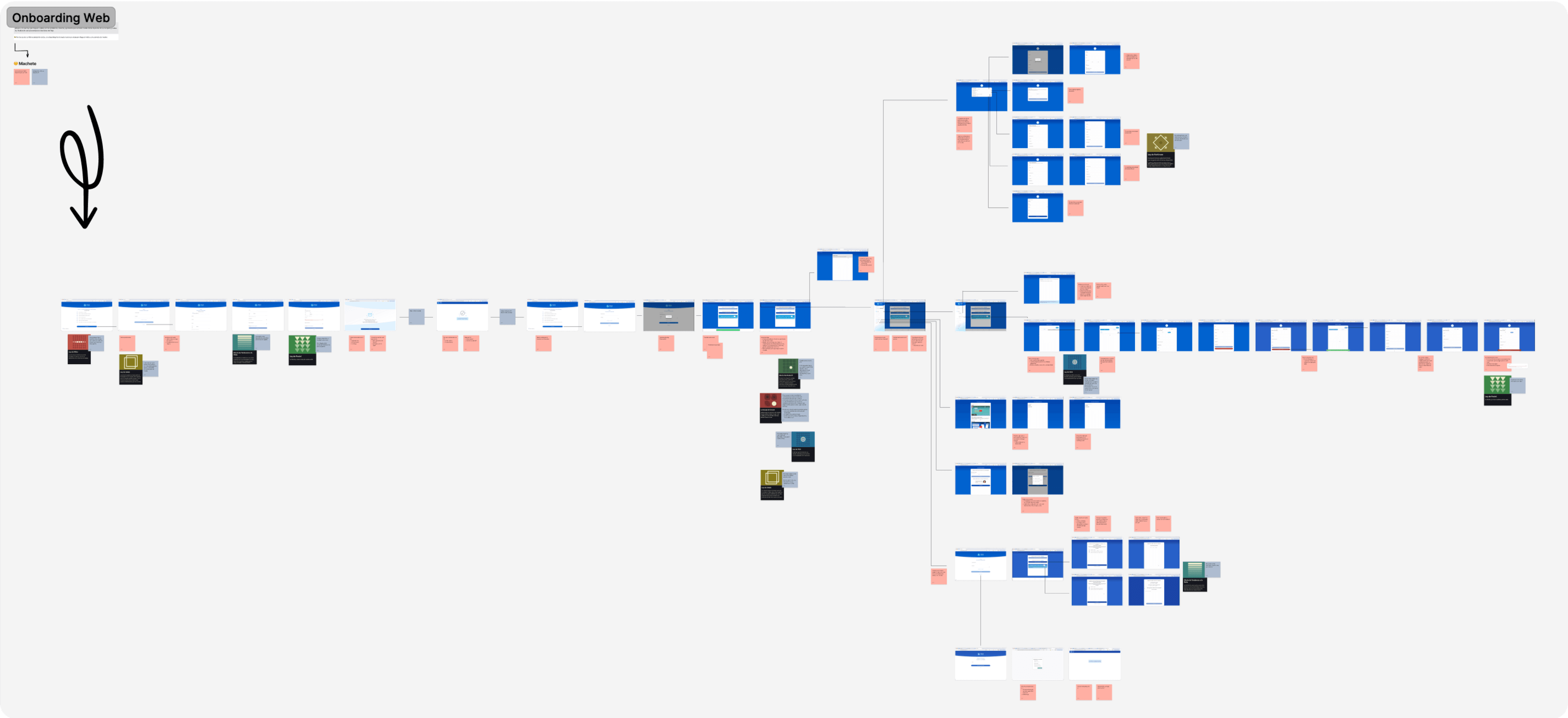
Screenshot of a FigJam board with onboarding flow screenshots and audit notes highlighting areas for improvement.

Screenshot of the first review of the flow with notes on what to improve and hypothesis.

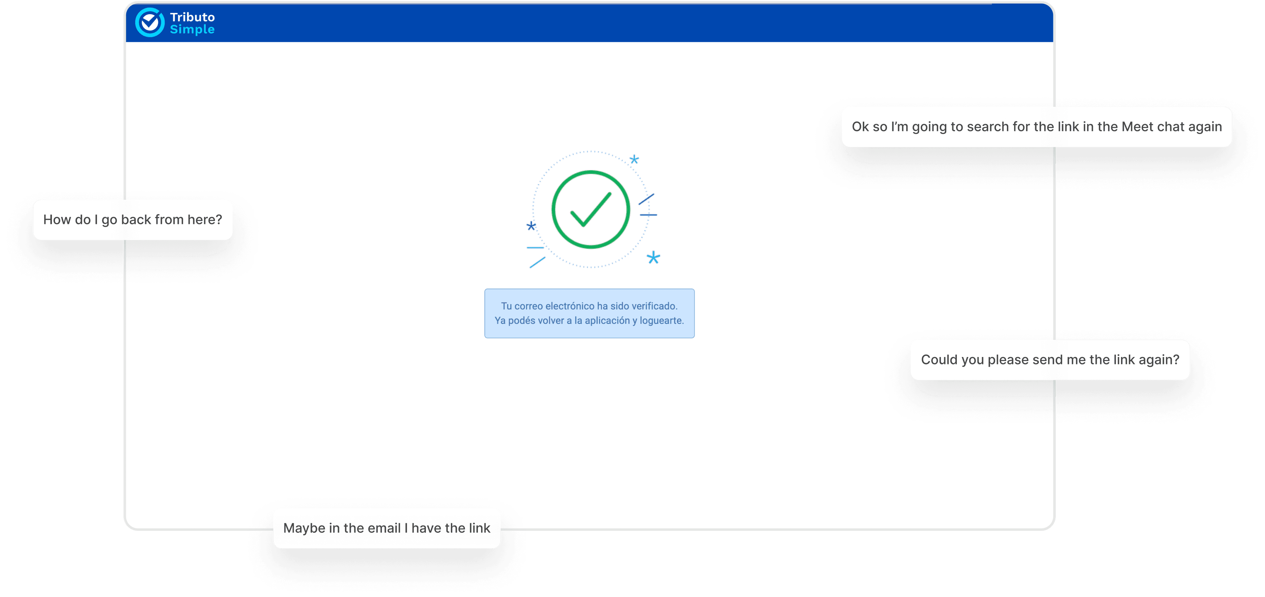
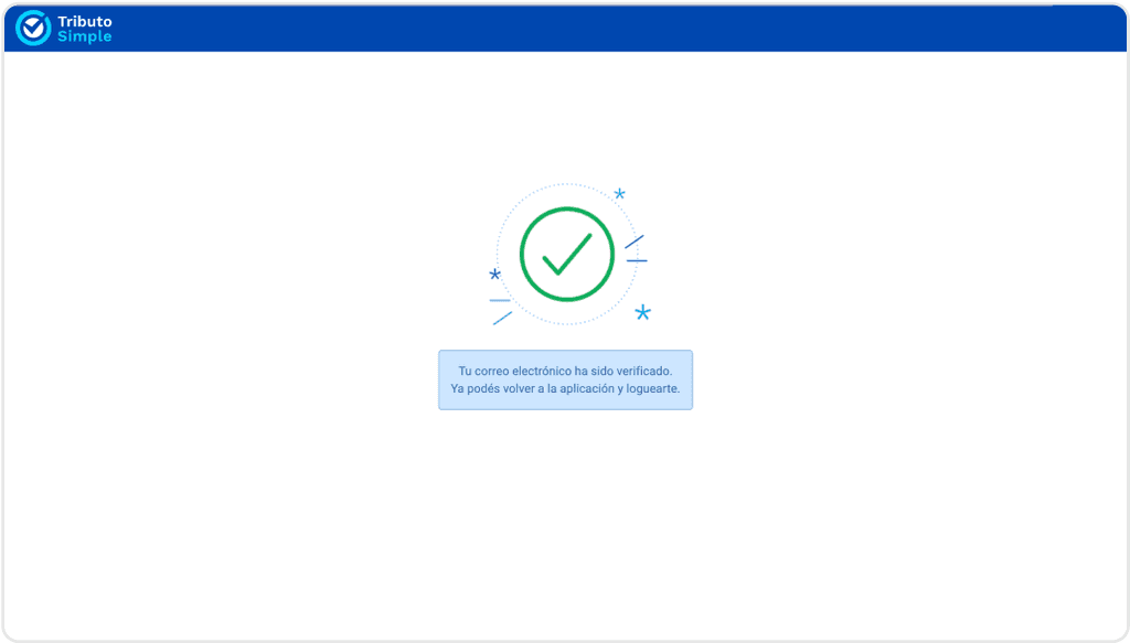
After analyzing the usability tests, I realized my hypothesis wasn’t all right or wrong: users didn’t struggle with receiving the email, the problem was that they don’t know how to get back to the app from there.

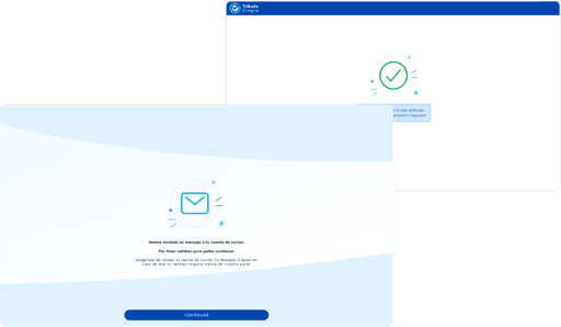
Screenshot of the email verification confirmation screen with user questions from usability testing displayed on the side.

Screen translation: Your email address has been verified. You can now go back to the app and login.

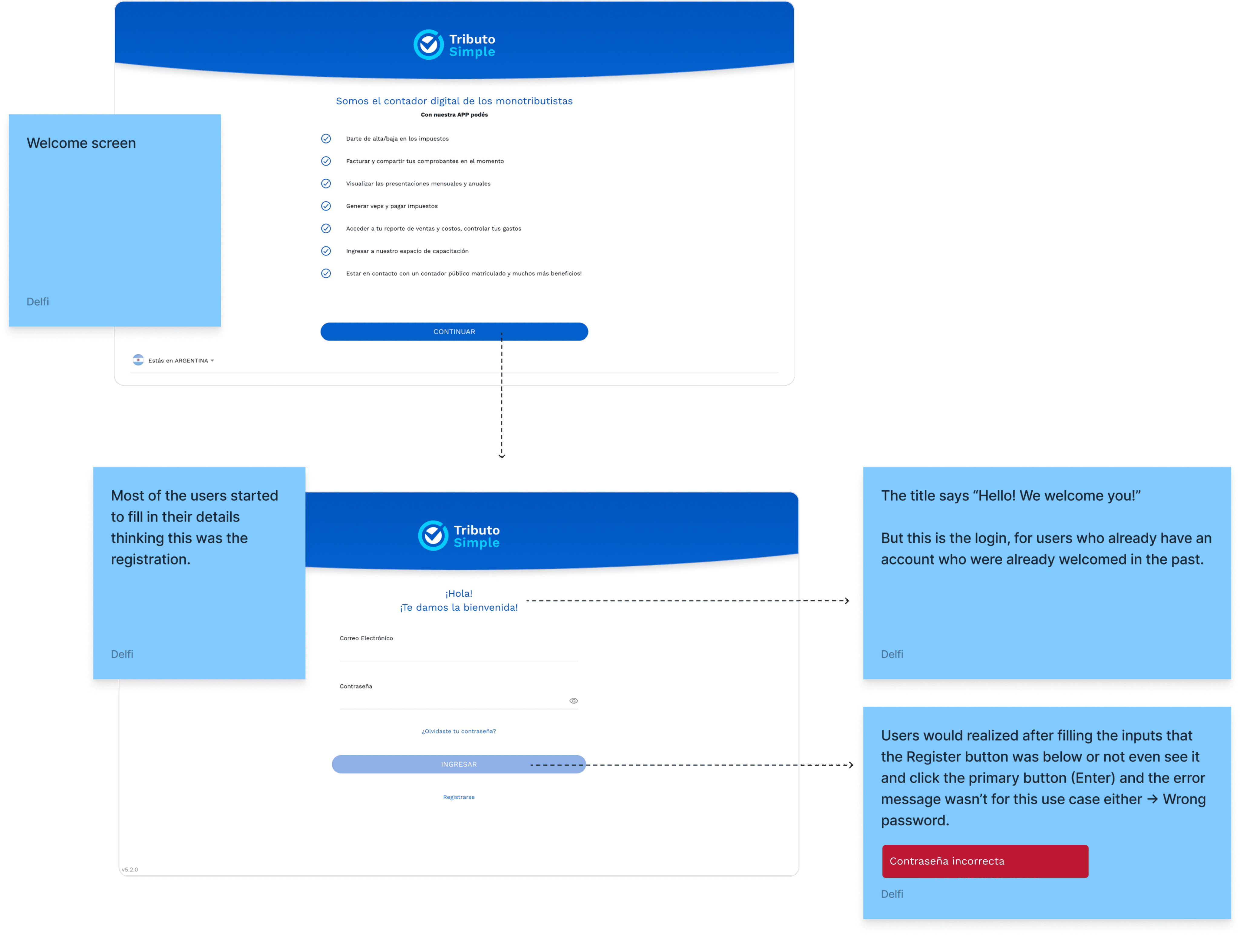
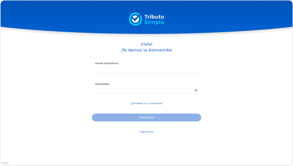
In addition, many users confused the login screen with the account creation process which was a significant issue.

Screenshots of the welcome and login screens, where users confused it with the account creation form, with post-it notes highlighting areas for improvement.

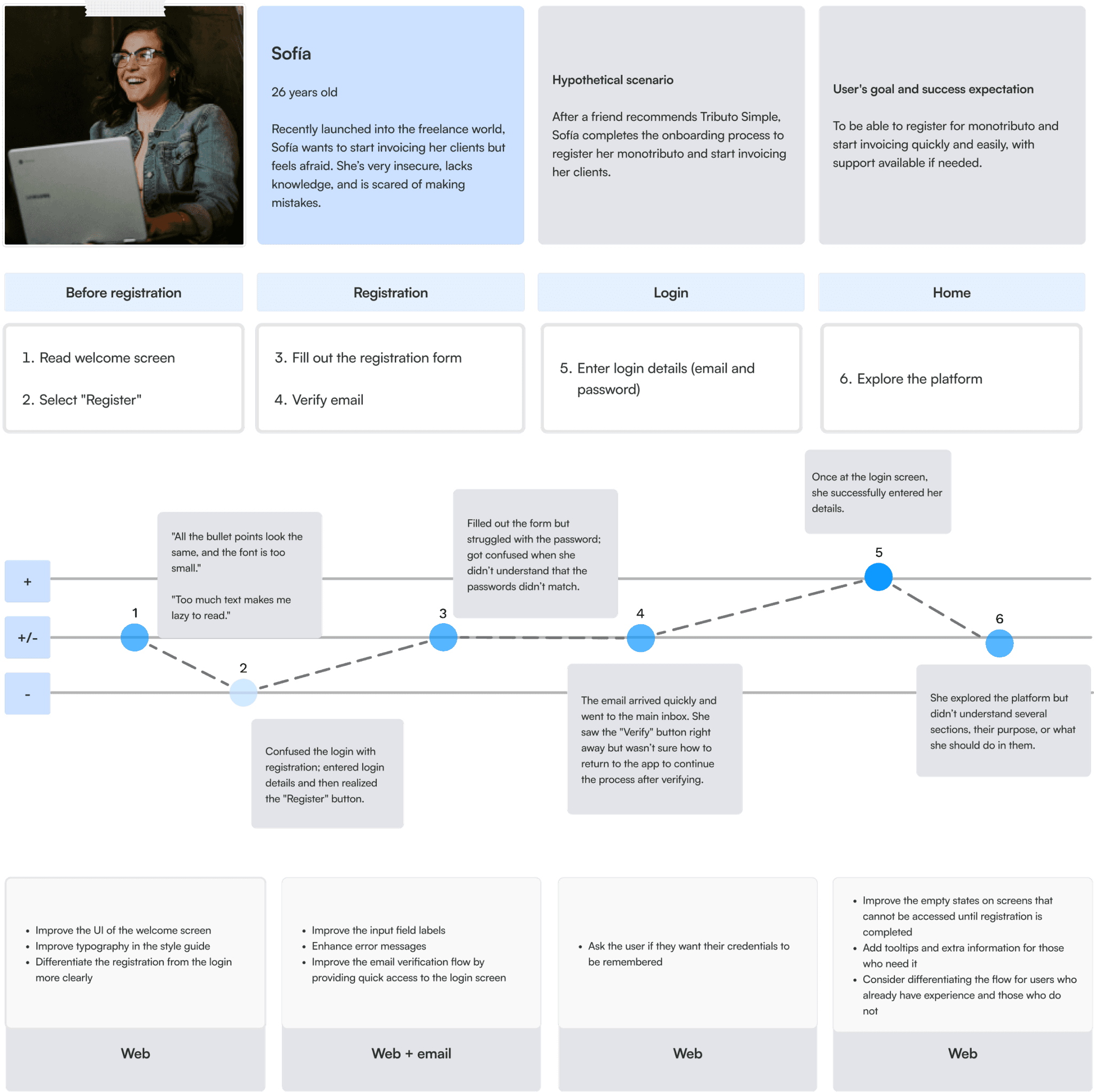
The usability tests allowed me to create 3 user personas and map out the onboarding journey, visually capturing where users encountered friction.

User journey map illustrating the onboarding flow, highlighting key steps and pain points.

Through this analysis, I realized there was an opportunity to improve the task flow cutting down unnecessary steps and making the process more intuitive:

Comparison of the original onboarding task flow with a new proposal that reduces the number of steps.
Main issues identified

The usability audit highlighted several critical issues in the onboarding process:

Screenshot from a usability test showing the app failing to load on a specific browser.
Browser incompatibility

The platform didn’t load properly on Safari.

Screenshot of the login screen, which many users mistakenly thought was the account creation flow.
Login confusion

Users mistook the login page for account creation.

Screenshot of the screen displayed to the user after their email is verified.
Email verification

Users struggled to return to the platform after verifying their email.

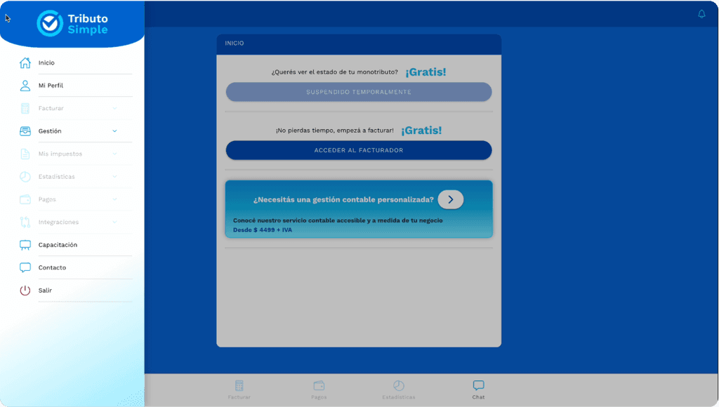
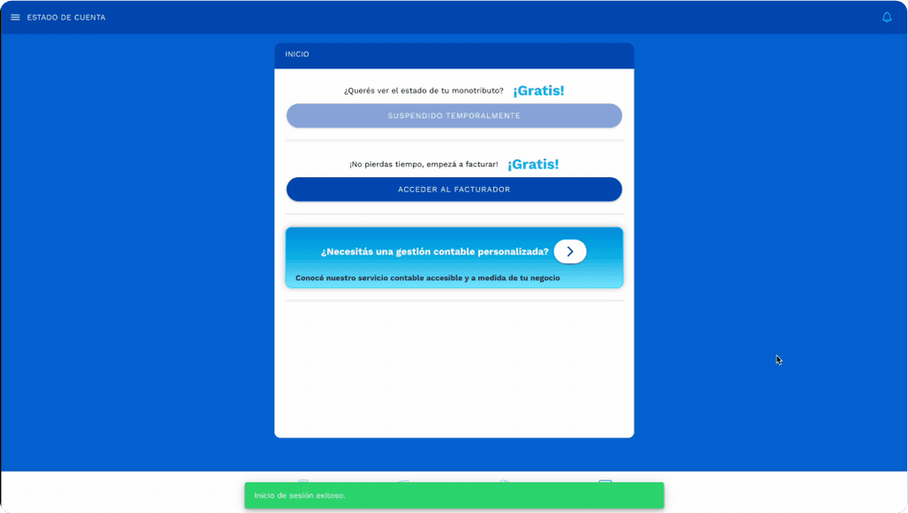
Screenshot of the app menu showing numerous disabled options, causing user confusion due to the absence of empty states and unclear descriptions.
Unclear pages once account created

Some pages lacked empty states, having the menu option disabled, leading to confusion.

Screenshot of the home screen highlighting accessibility issues in a callout component, featuring a saturated green background with white text.
Accessibility

Issues such as poor color contrast, small font sizes, and missing placeholders.

Two screenshots illustrating UI consistency issues in the onboarding flow, displaying different headers and backgrounds despite being part of the same process.
UI consistency

Inconsistencies were present across the flow: different background, headers, among others.

Deliverables and outputs

Once I had the analysis of the project, I moved on to create the presentation of this Audit. I used the Headway presentation template for my deliverable and made some changes I felt were necessary regarding color contrast to achieve better accessibility.

For this I started with an introduction of what it was done, an overview of the onboarding UX and some quotes from the usability testing.

Images of presentation slides including the introduction, overview, and user quotes.

I categorized the insights into four sections:

Image displaying category tags for the audit: 'Good!' in green, 'Must Fix' in red, 'Needs Improvement' in yellow, and 'Idea' in purple.

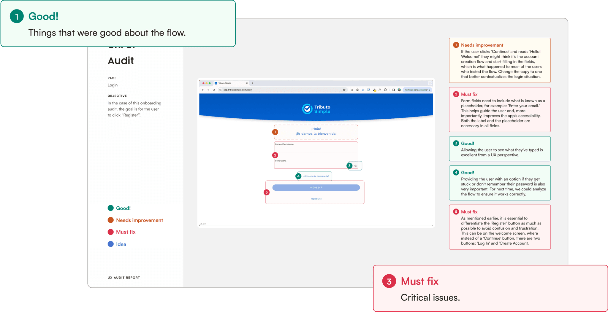
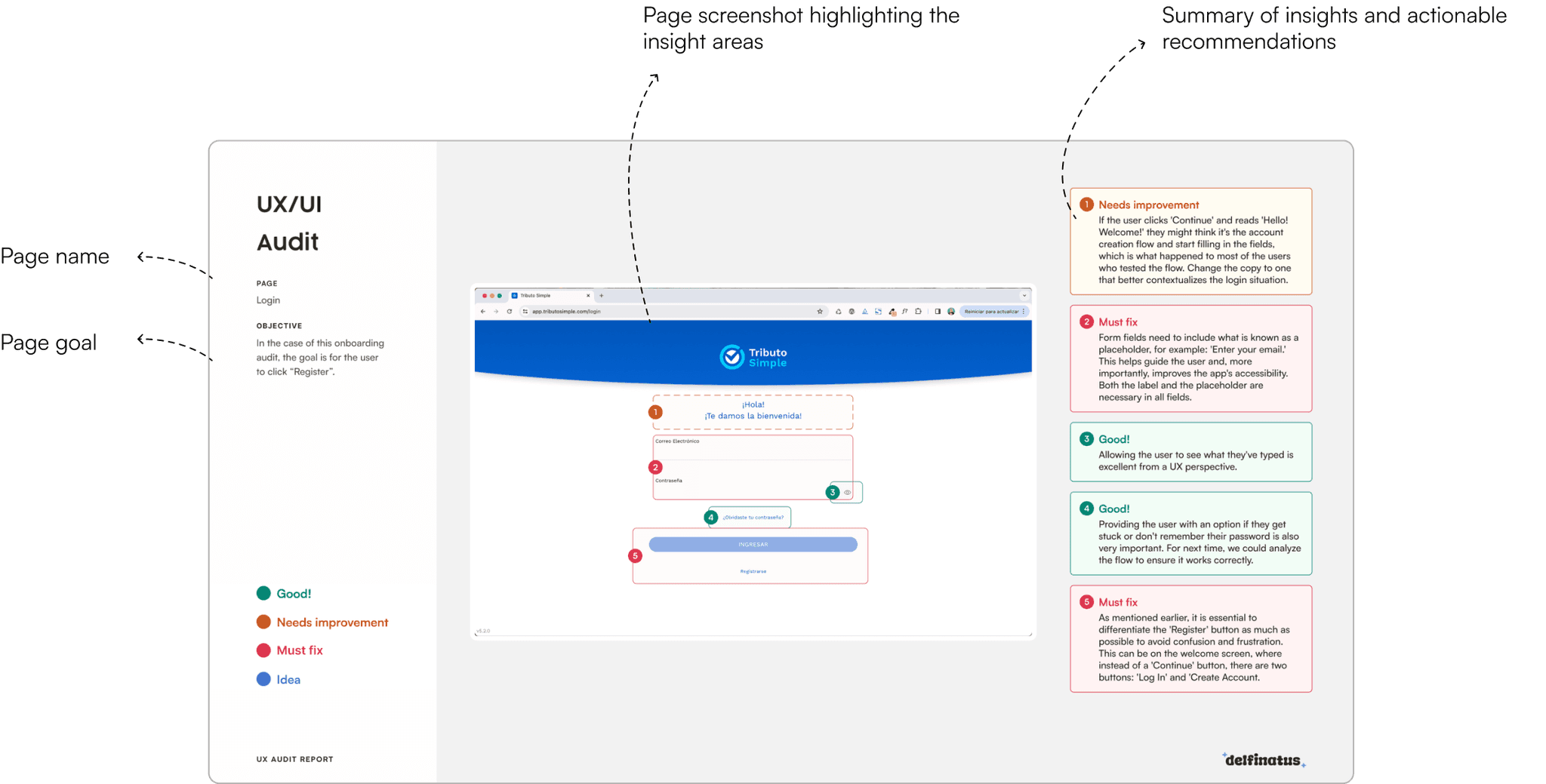
I presented each screen of the flow with the name of the page, the goal of the page and marking what were the things that were good, need improvement, must fix and/or ideas of each particular page. I also provided recommendations for improvements based on UX principles and testing results.

Image of a presentation slide featuring a product screenshot with highlighted areas categorized as 'Good,' 'Needs Improvement,' and 'Must Fix.'

In some cases, I created quick design mockups to visualize potential solutions.

Image of a presentation slide showcasing design examples for improving the screen based on different use cases.

The screens are in Spanish as it is the only language supported by the platform.

Action Plan

Lastly, I created a potential action plan of 10 weeks to improve this flow.

Images of the action plan developed for the audit presentation.

The tasks were prioritized based on their impact on the user experience and the estimated time required. The plan serves as a flexible roadmap (or a potential plan), since it will depend on the size of the design and development teams. I always recommend to take this plan as an start point.

Results

The UX audit provided Tributo Simple with clear direction for improving their app's usability. But don’t just take my word for it, here’s what the founder of Tributo Simple had to say:

Thanks to the report, we gained a better understanding of the real needs of our users.
The audit provided us with clear examples to improve usability, which allowed us to continue advancing in our mission to simplify the lives of entrepreneurs.”

Agustín Sosa.

CEO - Tributo Simple.
👽 Thanks for dropping by!
And please do your brain a favor by closing some tabs

Illustration of a smiley face

Don't get lost

Come say hi

Linkedin

👽 Thanks for dropping by!
And please do your brain a favor by closing some tabs

Illustration of a smiley face

Don't get lost

Come say hi

Linkedin

👽 Thanks for dropping by!
And please do your brain a favor by closing some tabs

Illustration of a smiley face

Don't get lost

Come say hi

Linkedin