Building a Design System
from Scratch
Intro
I started working in a Gaming company in 2023 they had a few existing products and were beginning to build a completely new one. One of my key tasks from the start was to set up and manage the Design System.
To give some context, this company had never had a Design System. They were building products without a designer involved in the process; sometimes even the PM was designing in Figma. This meant that every time the team started a new project they created multiple components from scratch and a new library each time. Therefore, we had many similar components with different styles.
Working as a team of 1 meant I had limited time to develop the Design System alongside my other UX work. The Design System needed to be scalable and a single source for viewing components, styles and more.
Research and planning
The first thing I did was to audit the existing products to identify the components and styles we were using: how many versions existed and which were needed.
These were my main insights:
Inconsistency: the same component with different styling across different flows and icons from different families everywhere.
Lack of accessibility: colors and fonts were not optimized for accessibility, it was almost non-existent.
🤝 Teamwork
Its important to note that the conversation with the frontend team was crucial for understanding where we were and determining how to move forward to create a path that would work for everyone.
From the beginning they told me they were using Material 2 and we knew that if I used it as a base for the Design System, implementation would be faster and easier.
Another big part of this is the negotiation with the PM to plan and implement the Design System. Each team (dev and design) had their goals to achieve, meaning they will be working on multiple things at the same time, so we wanted to prioritize based on what the dev team will work on.
Based on this we knew that:
1
A single source of truth
We would establish a single source of truth for foundations, styles and components.
2
Material 2 as a base
We were going to use Material 2 as a base for the components, customizing as needed. Every time I had doubts about a customization, I’d talk with the frontend team so we could be aligned.
3
New product = new design system
The new product was going to be build from scratch with the new Design System.
4
Other products will be updated in stages
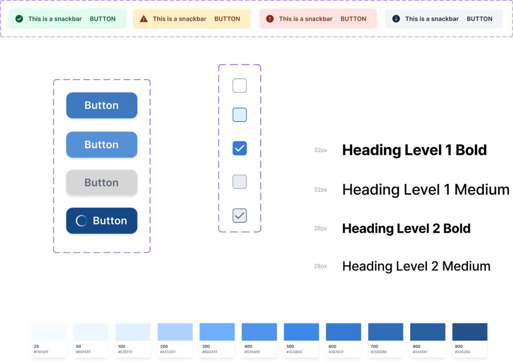
The main styles and components were going to go first for all products (header, sidebar menu, color, fonts, among others). Other components would be updated as they were needed in the new product. For example, if a new screen required a button, buttons across all products would be updated.
The last point means that for a while some flows would remain inconsistent for a while, but that’s part of the process and the real world. It’s okay if the UI isn’t perfect for a bit, as long as we continue updating components and work toward the main goal of having one Design System across all products. The ultimate benefit would be a system that’s easy to maintain on both the design and development sides and is scalable.
Laying the foundations
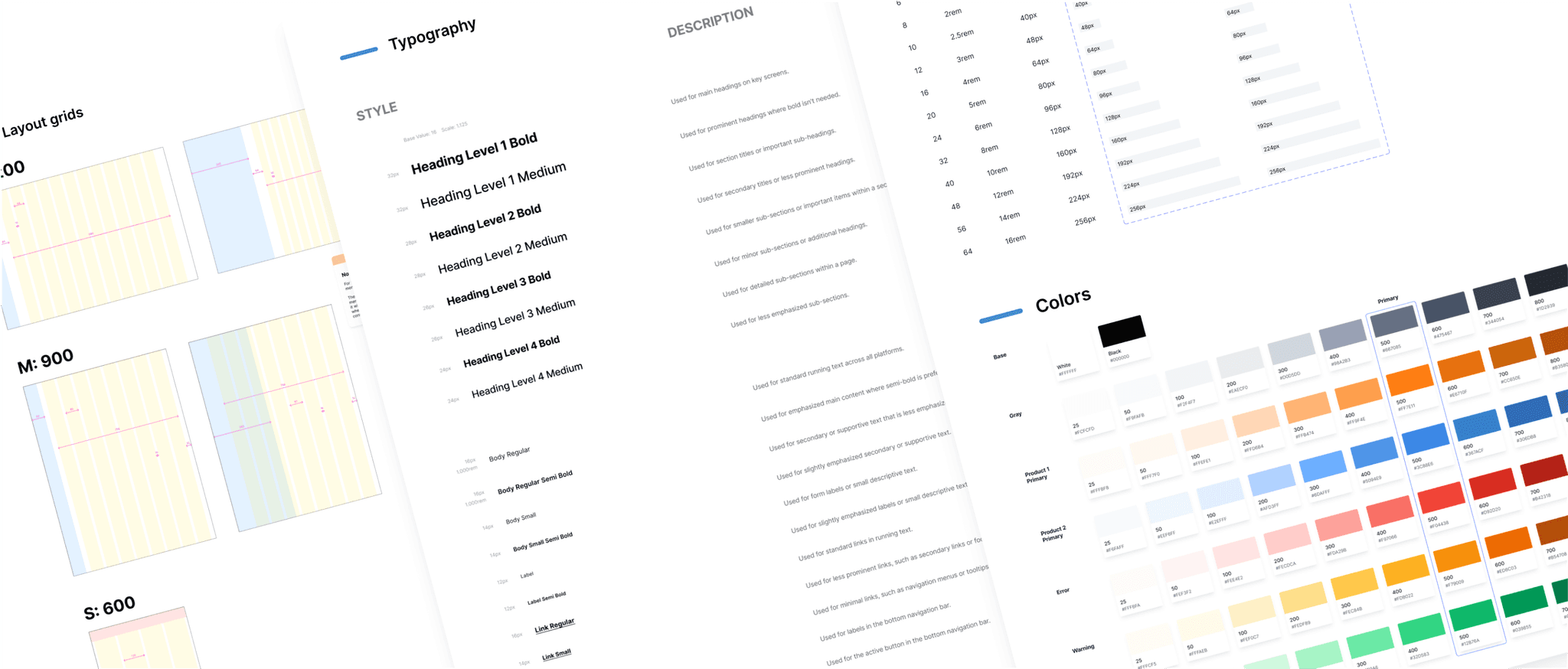
Building a Design System from scratch can be overwhelming, there are many things to consider. However, the best way I found to start was by establishing the foundations:
Typography
Colors
Spacing
Shadows
Layouts
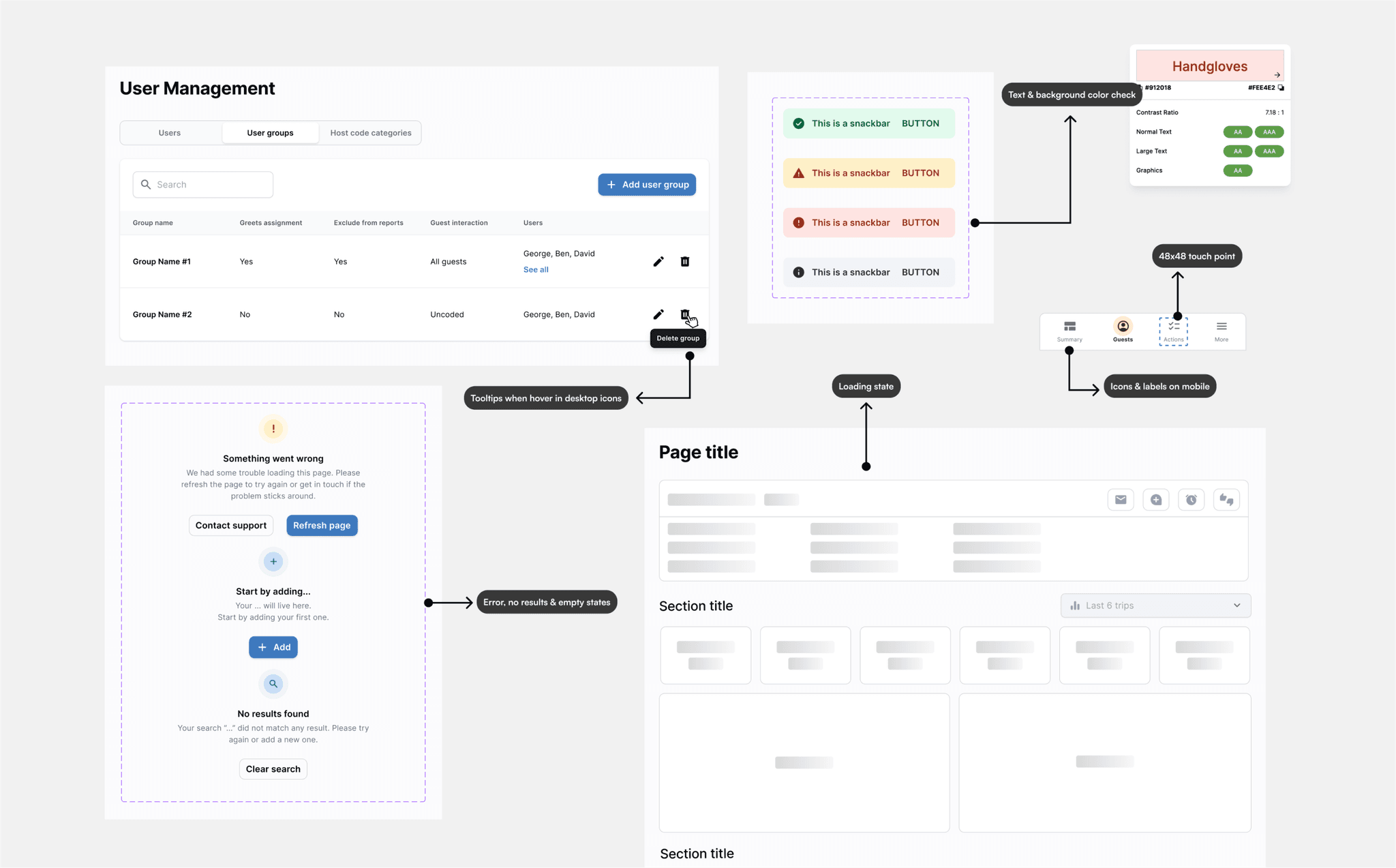
⭐️ Prioritizing accessibility
The advantage of building a Design System from scratch is that you can prioritize Accessibility and keep it in mind from the very start rather than treating it as an afterthought.
Here’s what I focused on:
Font size → the baseline was 16px with only 2 smaller size (14 and 12) for specific use cases, which were documented.
Icons + text labels → icons should have text labels on mobile; when displaying an icon without a label on desktop, tooltips are mandatory.
Touch targets → minimum size of 48x48px.
Color contrast → for each color I created different shades to be able to play around with the depth of elements, however we aimed for at least AA for color contrast.
Screen states → the user should always know what’s happening: loading state, general error state and specific errors based on use cases discussed with the dev team.
Components
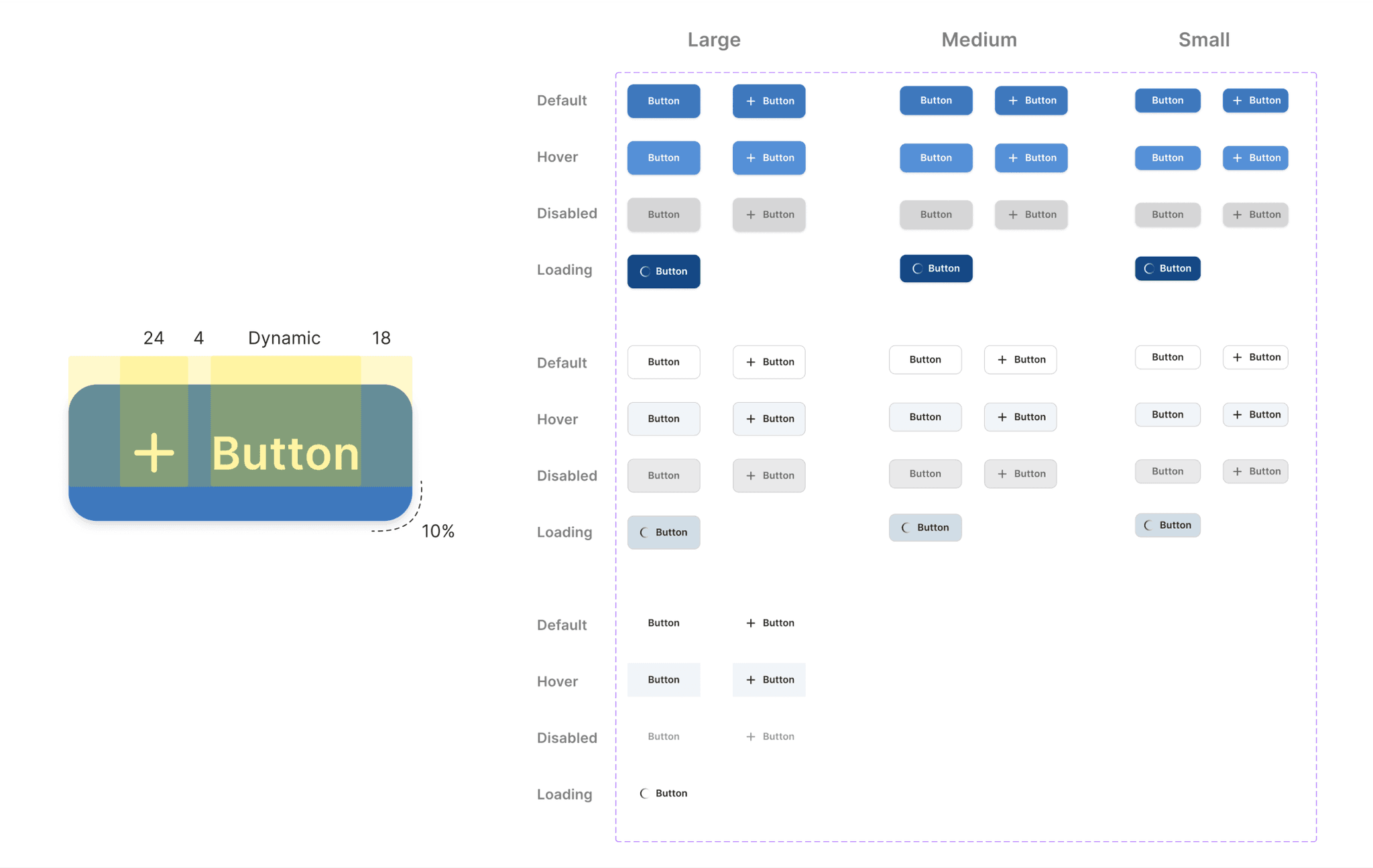
The next step was to start creating components, which I did using the Atomic Design approach. I started with a set of components that I identified in the Audit that we were using everywhere, keeping in mind every state needed for each of them.
As mentioned before, the goal was to build a scalable system, meaning that if in the future I need a new component or variable, I could quickly add it to the Design System, avoiding ghost components or detached instances.
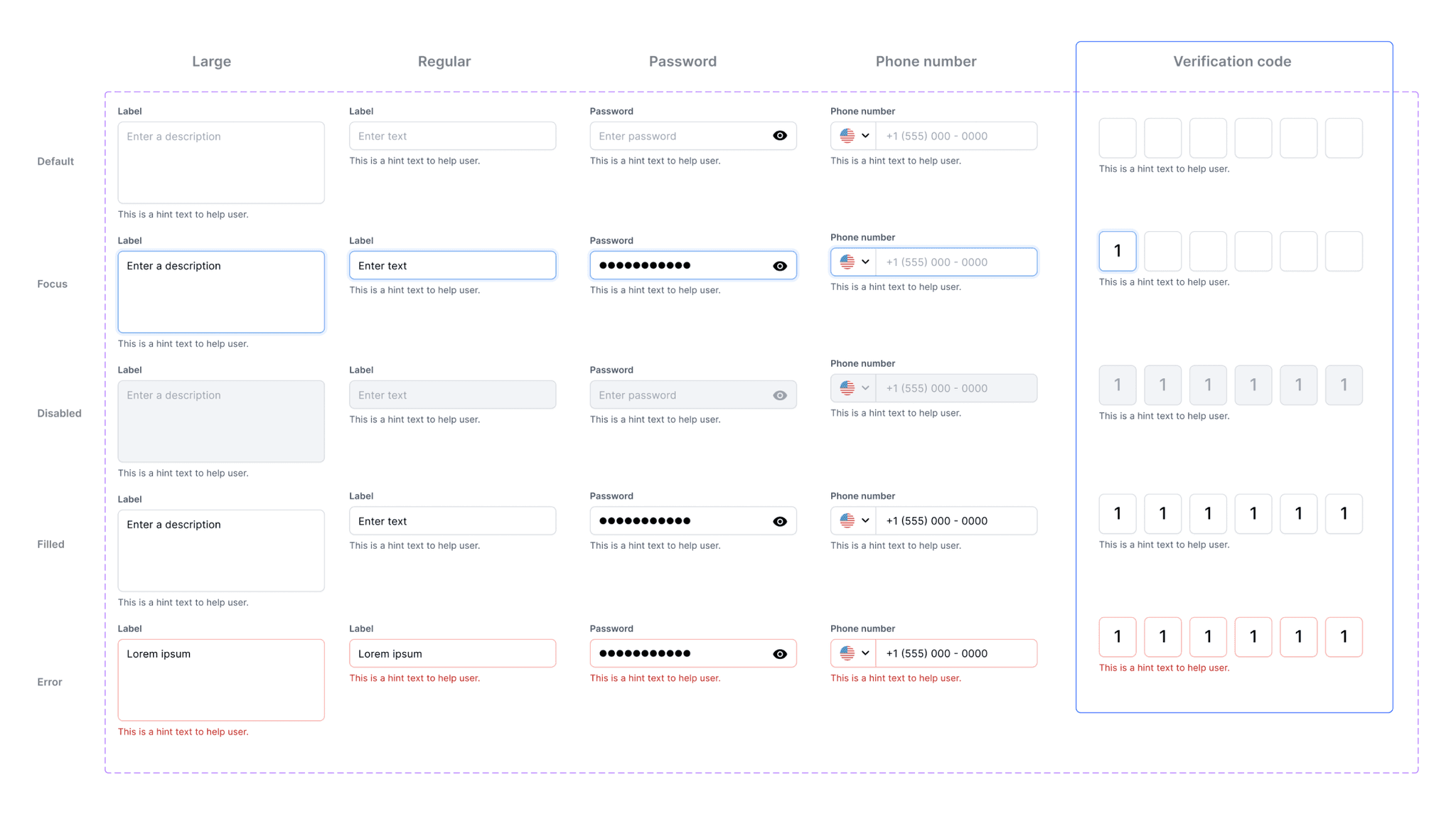
For example, not long ago, I had a project that required a verification code screen. I needed a verification code text field for it. Since I already had regular text field components in the Design System, I was able to quickly create the new one with all the necessary states and add it to the system for future use, instead of having a new component lost in a design file.
Some challenges arose in the process. For example, the sidebar menu had multiple use cases depending the product. It was used in report products where the names were very long, or there weren’t many Material Icons available to represent each report. For this, it was crucial to review each product and use case, take screenshots, and analyze the best approach.
Results
After a 8 months working on a progressive and never ending Design System (the idea is to always keep it alive!) we were able to create the MVP of the new product with the new look and feel and to update 85% of the other products. These were the main benefits:
Consistency across different products: 1 icon family, 1 font family and consistent components across different flows.
One source of truth: whenever someone had a doubt about a component or style, we had a document to consult, this was huge across different teams.
Faster design, faster development: implementing a Design System takes time, yes; but the time you save once you start using it is incredible. That’s the magic of reusable components.
