Educating and Empowering
Redefining fund reception
Intro
One thing I learned while working at Utoppia is that the USA banking system is completely different from what we're used to in Latin America. We're accustomed to receiving and sending money instantly using a simple transfer method, but that's not the case in the USA. Waiting times are different, and there are various transfer methods.
In this case study, I'll share how we revamped the Receive Funds flow to make it clearer and educate users who may not have experience, to make the transition as smooth as possible. I collaborated with Juan Falabella, our UX Lead, to tackle this challenge head-on. This case study underscores the significance of teamwork as we navigated this complex issue with support from both our Support and Data teams.
The problems
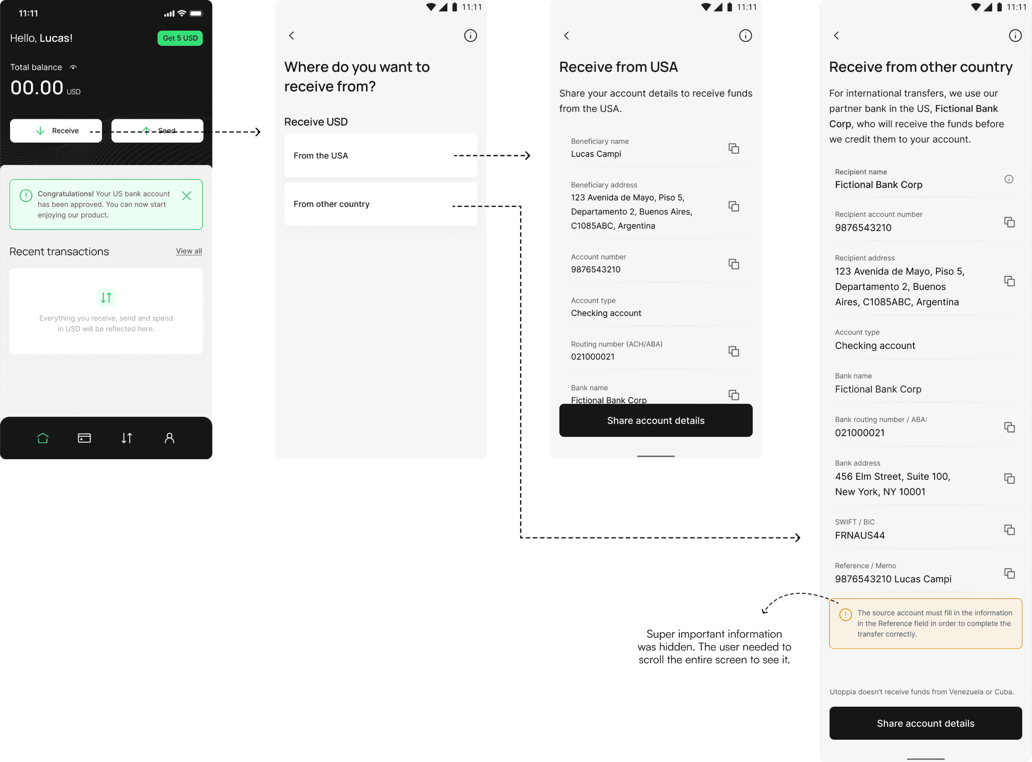
When we launched the beta version of our app, we had a screen where users could select whether they were going to receive funds from the USA or another country. Regardless of their choice, they would encounter a screen filled with account details but lacking context. Consequently, we began receiving a high number of support tickets because:
1. Users reported that they hadn't received their money.
2. Users didn’t understand the details they needed to use on other platforms to send their USD to Utoppia.
These problems also impact the trust of the app. After all, we're talking about users' money and a new startup that they might not be sure will succeed. What happens if they don't trust it or face issues? Bad reviews, fewer recommendations, and a lower registration and activation rate.
Let’s not forget that Receiving USD is the first step to using the app, is the way we get users to activate their account (read more about this here).
Business goals
📉 Decrease the number of Support Tickets by educating users about the USA banking system: Giving the users enough information to address common issues beforehand, and so reduce the need for support tickets.
🤝 Increase the Activation Rate by building trust: By enhancing the flow, building trust in users, and getting positive reviews for the app, we aim to create an environment where new users feel confident and comfortable activating their accounts.
Given these goals, we asked ourselves:
How might we improve the Receive Funds flow to earn users’ trust and reduce support tickets?
The solution
We understand that trust isn't something you build by simply improving one aspect; it requires multiple approaches. That's why we're exploring various strategies, such as webinars and showcasing the real people behind the app. However, enhancing the Receive Funds flow plays a crucial role in fostering trust with our users, making them feel confident enough to activate their accounts without constant assistance. Here's what we did:
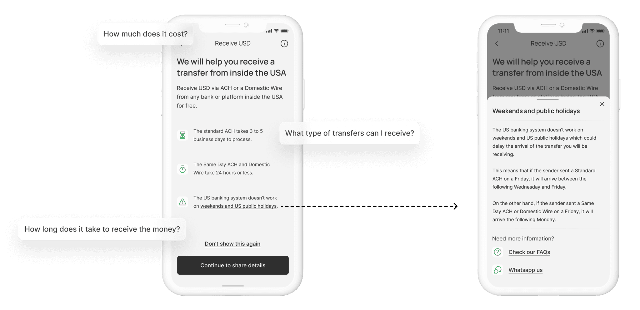
We integrated a lot of information about how transfers in the USA work into tooltips and a dedicated screen. Users have the option to choose whether they want to continue seeing this information.
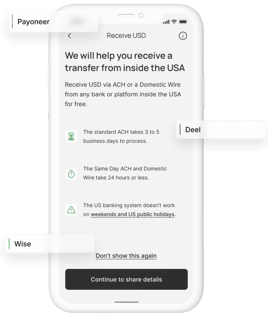
We implemented a dropdown where users can select the platform from which they will receive funds. This ensures that users receive precise information tailored to their needs.
A deeper dive into the solutions and its process
Educating our users
Through analysis of support tickets, we recognized a gap in users' understanding of the USA banking system. To address this, we prioritized educating users on key aspects, including:
💸
Supported USD transfer methods
⏳
Expected transfer wait times
📣
No USA transfers on weekends/holidays
🔔
Reminder to check their account limits
To kickstart this initiative, we redesigned the Receive Funds screen, adding clarity by providing additional information within the button. This ensured users understood the transfer method for receiving USD from both within and outside the USA.
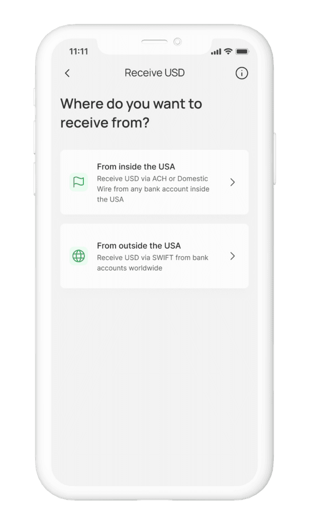
Then, we decided to add some new screens, specially for the newbies, where we displayed some key information they need to know when receiving funds in the USA.
As I said before, in Latin America we are used to tapping a button and transfer money, but in the USA the ACH transfer takes 3 to 5 business days to process and the US banking system doesn’t work on weekends and US public holidays. How wouldn’t they complain about not receiving their money if they didn't have this information?
Our approach was to educate users without overwhelming them. Therefore, we incorporated a "Don't show this again" button, allowing users to skip this step once they had the necessary information.
For transfers inside the USA we wanted to answer the following questions:
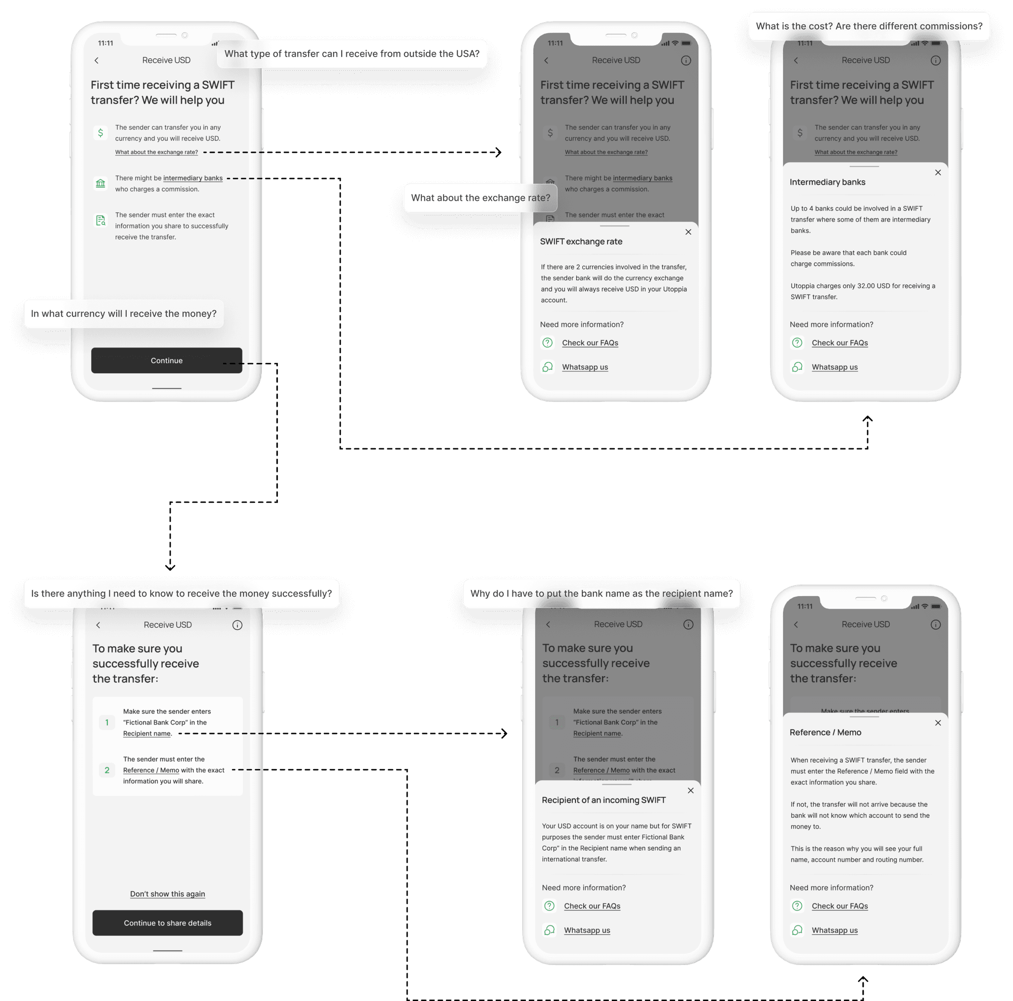
On the other hand, for receiving transfers from outside the USA, we wanted to answer these questions:
The initial screen would be displayed for first-time recipients of SWIFT transfers, while the second one would remain available until users opted not to view them again.
SWIFT account details and some tips for the sender
When it comes to receiving a SWIFT transfer, the account details are pretty standard. We redesigned the screen adding the extra info we needed and tidying up the layout. Here's where we remind users to check their limits, so they know their receiving capacity.
All the information explained in the screens above will continue to be there for whenever they need it in the tooltip, which we like to think is our educating space.
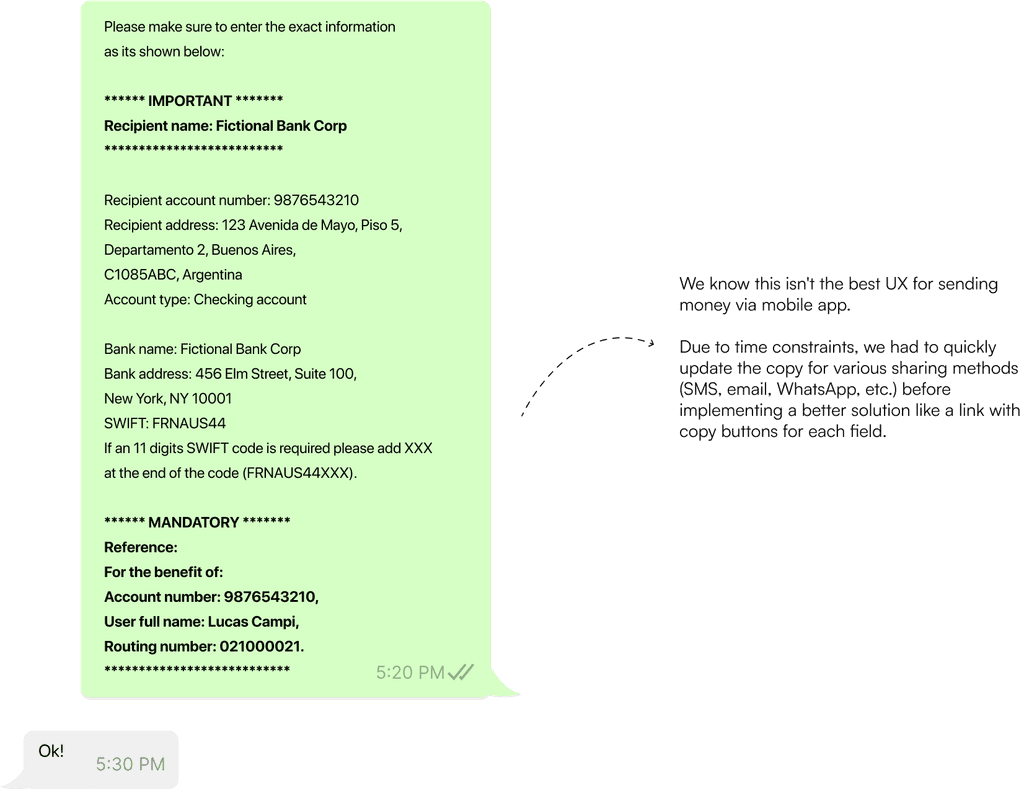
But hey, it doesn’t stop with just the screens. We also worked on a new message for when users share their account details. We highlighted the most important information for a successful transfer, all based on what we learned from the support tickets:
- Make sure to put the bank in the recipient name.
- If the SWIFT code needs 11 digits, tack on some XXX at the end.
- Don't forget to include a mandatory reference.
Receiving funds from different platforms
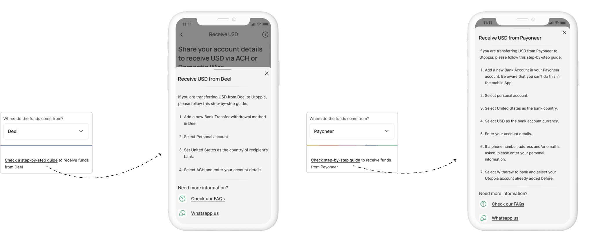
Most of our users are within our Remote Worker and/or Freelancer personas. They usually receive funds from platforms inside the USA that aren't traditional bank accounts. Before the redesign, the user used to see a screen with the listed account details, but when they hopped over to other platforms they would get confused and wouldn’t understand what were the account details they needed to fill in, or they would think we weren’t providing all the information they needed.
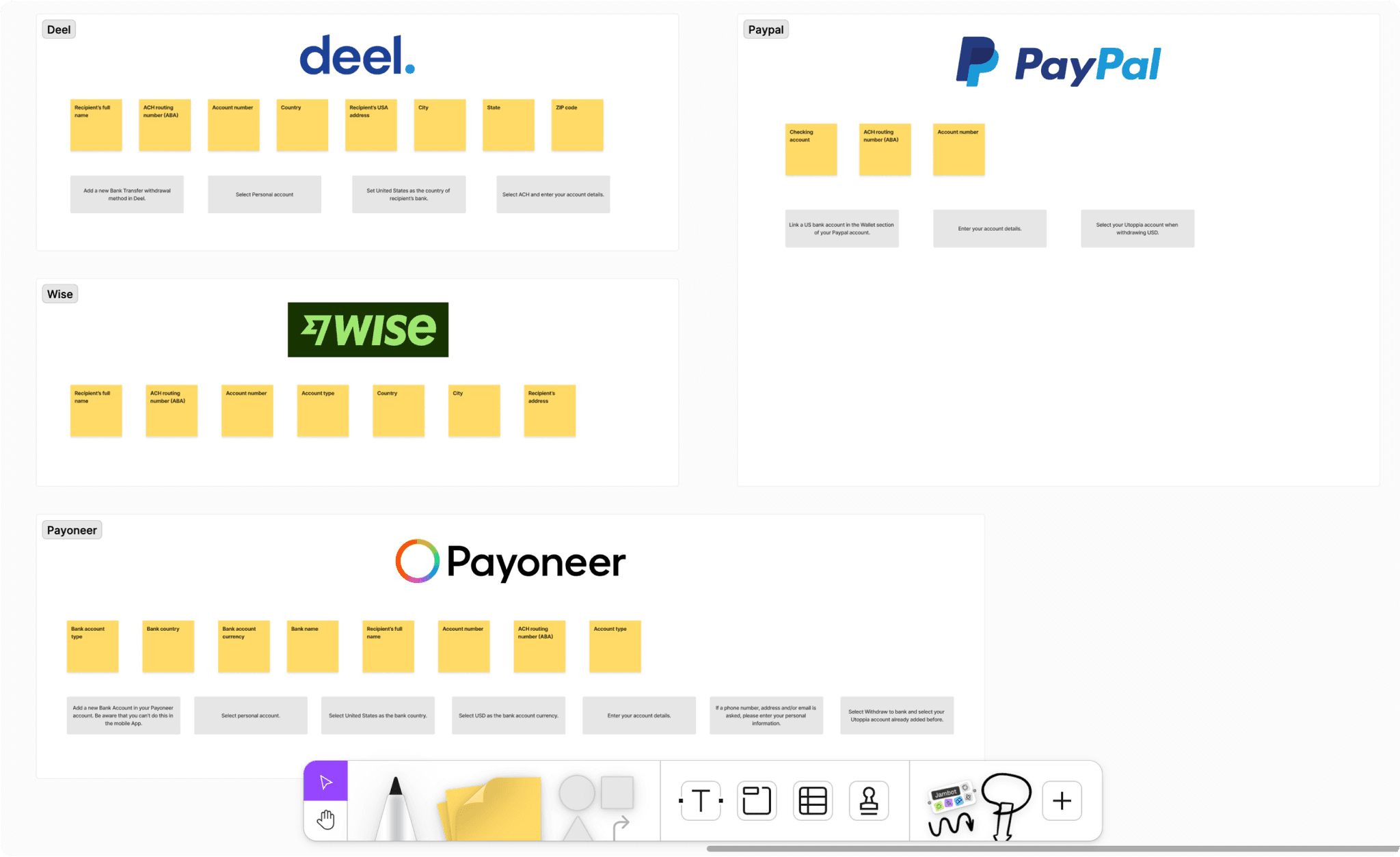
We tackle this issue by mapping the required information of the most-used platforms (shoutout to our Data team for providing this information). While doing this, we realized that they were asking the same information but in a different order or with a different name.
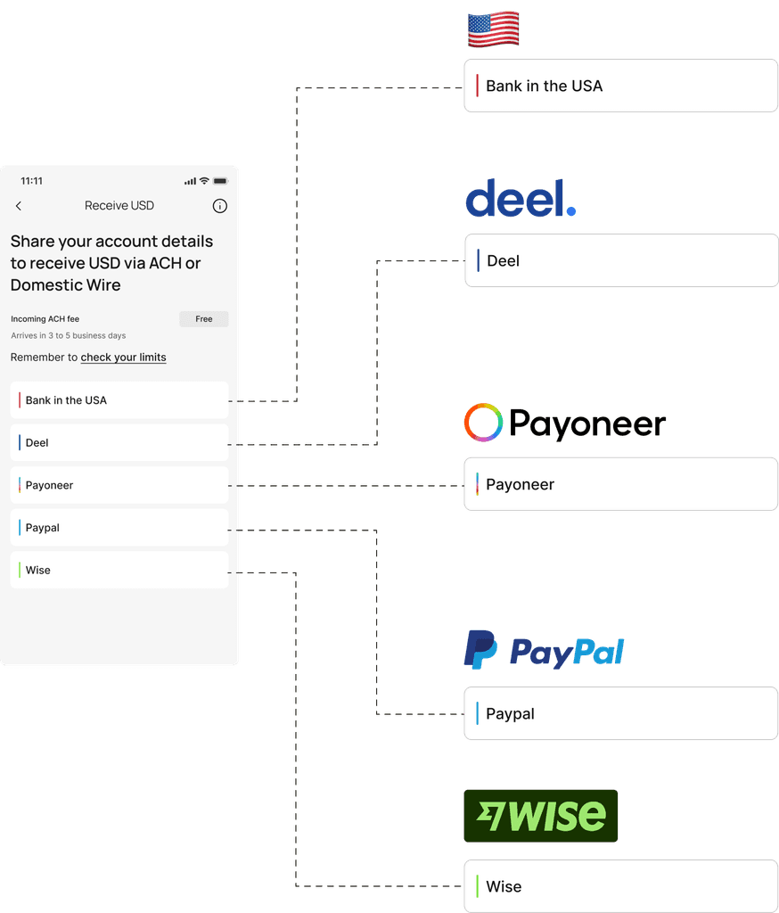
We decided to add a dropdown where users could select the platform from which they were receiving funds. "Bank in the USA" was the default option, but they could choose others. Depending on their selection, the listed account details would adjust labels or order, ensuring a seamless experience transferring funds to Utoppia. In addition, all the info provided earlier about the transfer is available in a handy tooltip.
Now, we wanted to jazz things up a bit visually. We knew we couldn’t use the actual logos so we did something similar to our “no-logos” (explained in this case study), and added a color line with the palette of each of the different brands, helping users quickly identify the platforms.
And just like with SWIFT account details, we didn't forget to remind users to check their account limits.
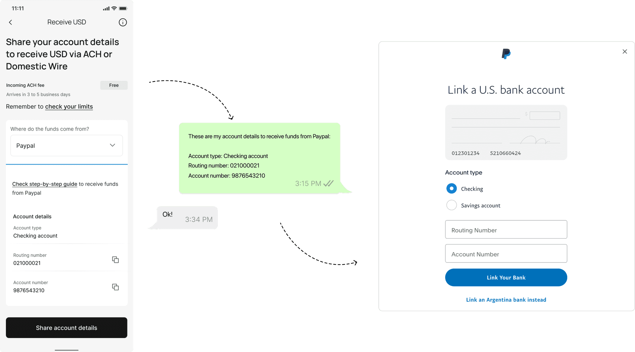
For the ones we consider they might need extra help, we also added a step-by-step guide in a tooltip:
Plus, each platform comes with its own custom message once users share their account details:
Conclusion
So there you have it! The journey from facing numerous support tickets to crafting a seamless user experience demonstrates the power of understanding user needs and iterating upon feedback. By addressing the lack of clarity surrounding the USA banking system and empowering users with informative screens and tooltips, we transformed a potentially daunting process into a user-friendly experience.
Sure, fixing up that dropdown feature with its step-by-step guides means we'll need to keep an eye on it and make updates now and then. But we're all about keeping things real and making sure our users get the best experience possible.
As we move forward, we remain dedicated to refining our processes and listening to user feedback. With each iteration, we strive to uphold our commitment to providing a seamless, trustworthy, and empowering platform for our users. This case study serves as a testament to the importance of teamwork, highlighting how collaboration between different teams enabled us to overcome challenges and achieve success.
