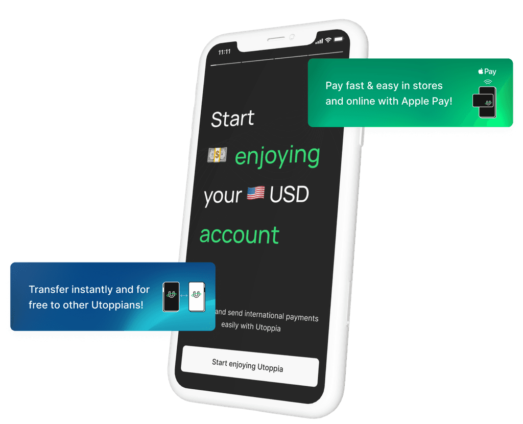
Unlocking Engagement
A case study on user activation at Utoppia
Intro
How many times have you downloaded an app, registered, closed it and never opened it again? Yep, it happens.
In this case study I will continue with the onboarding and activation problems we faced at Utoppia and how we solved them. In a previous case study I wrote about how we had people downloading the app but not registering.
Now I’ll write about how we had some people downloading, registering, but not using the app and how we solved it. I worked with Juan Falabella, our UX Lead, to tackle this issue.
The problems
We've already discussed our onboarding and KYC issues in other case studies. Now, we'll continue by explaining the key problems we faced once the user had their account approved:
Problem #1
Registrations without Activation
One surprising revelation from the Activation Team was that 60% of users complete the registration and KYC process, get their accounts approved, but 80% of these users show no activity after registration.
Once we started talking about this, we realized we were missing a good opportunity here: showcase what the users can do with our app, resulting in a motivation for them.
Problem #2
Lack of Guidance
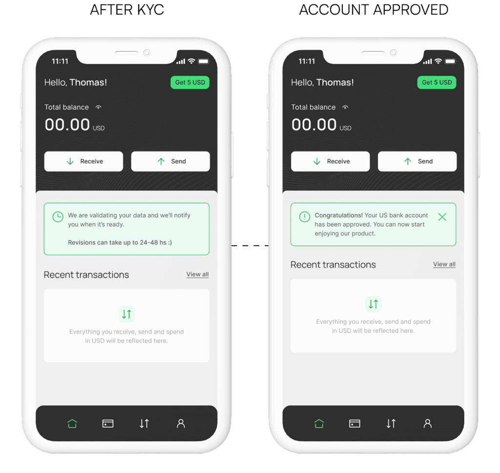
Once the account was approved, users would receive a notification, see a callout of something like “hey your account got approved, enjoy” and that was it. We weren’t providing users with clear direction on what to do next.
Business goals
📈 Increase the Activation Rate: 20% increase in the activation rate among registered users who currently show no activity.
🤓 Improve the Activation flow for users without experience with USA accounts: Guiding users on what to do next, decreasing the learning curve.
The solution
Within our personas, it's common for individuals to download apps, register to explore their features, and then decide whether to continue using them or look for alternatives. Additionally, some users may be new to apps like ours and may not know how to proceed. We saw this pattern in the research we did for this project.
Additionally, some users may be new to apps like ours and may not know how to proceed. To address these scenarios, we devised a solution. To address these scenarios, we devised a solution.
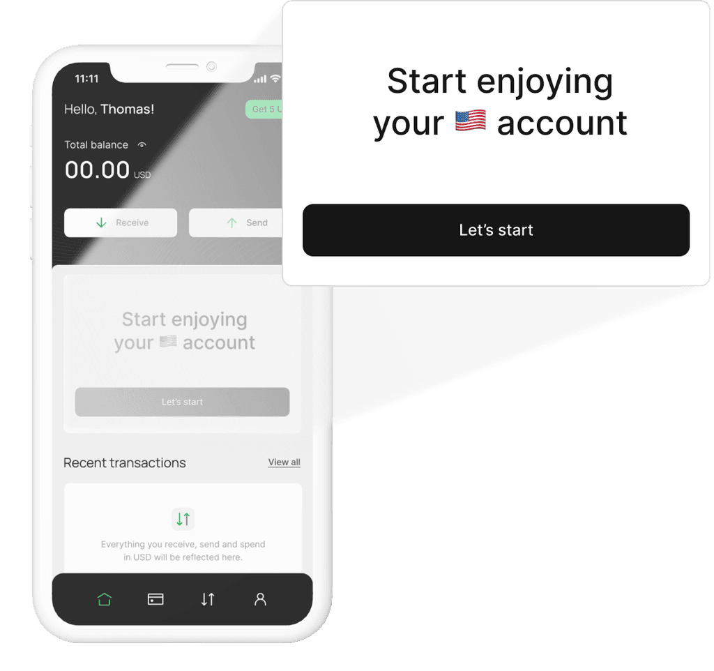
We implemented The Big CTA on the home to welcome users back to Utoppia. This CTA not only guided users on what to do next but also highlighted the benefits of using our app, aiming to address motivation issues.
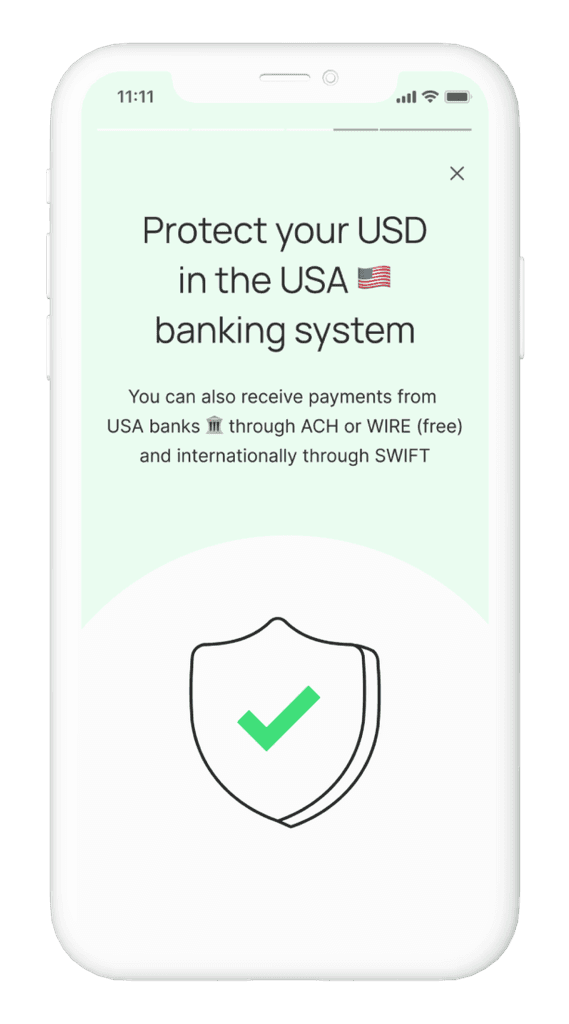
Moreover, we recognized the trust issues inherent in finance apps. Therefore, we took this opportunity to enhance our communication, ensuring users received the reassurance they needed to trust our application.
As a result of these efforts, users not only felt guided on what steps to take next but also felt encouraged to try out the app by activating and using it.
First steps
The first thing we did was to do research. We sent out a survey and also we conducted user interviews to understand the reasons behind user inactivation. You can see the process of this research in this case study.
From the research, we had 3 insights and one of them was that users feel curiosity and interest for Utoppia because it’s a new alternative to earn their salaries but do not have a need or motivation to migrate their money to a new platform. This is the one that we tackled for this case study.
On the other hand, when we initiated this project, we were determined to continue incorporating gamification into the flow, just as we had done with the onboarding process. But we realized that the experience needed to be improved from a little earlier in the flow, before having their account approved.
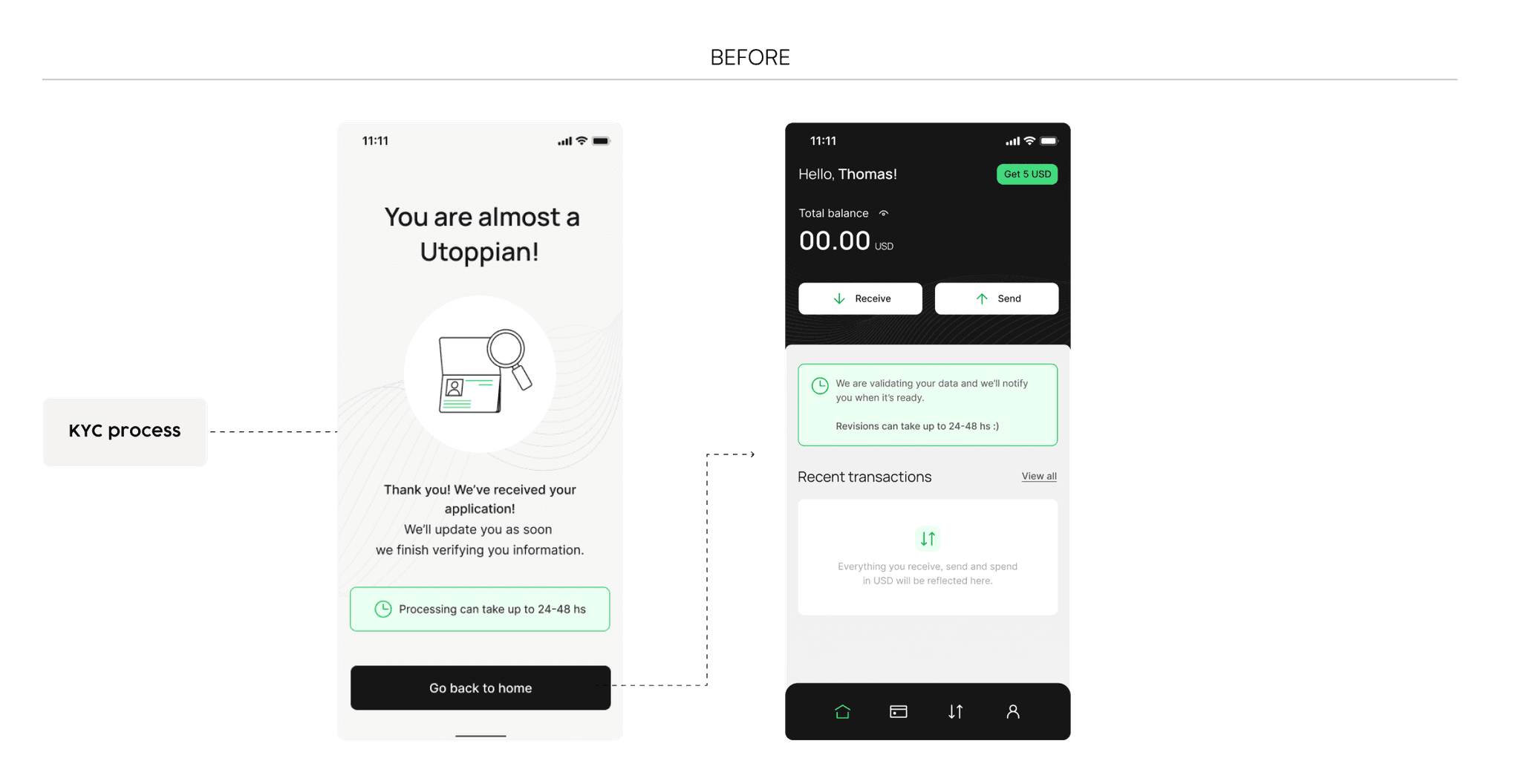
If we take a step back, once users finish the KYC process, they have to wait up to 48 hours to get their account approved. Recognizing this potential friction point, we understood the importance of adding something more than a simple “ok great, we will let you know in 48 hours good luck”. Take into account that this could be a huge risk of not getting them back to the app never again.
So from the start we knew that:
- We needed to start earlier, when the user finished the KYC process.
- We needed to continue adding gamification elements to the UX.
How to take advantage of user downtime
As explained above, users needed to wait up to 48 hours to see if their account will end up being approved. So imagine this: you download the app, you register, you do a KYC (let’s be real, we all kind of hate the KYC) and in addition you need to wait to use the app. Did someone say friction?
During brainstorming sessions, we generated numerous ideas for utilizing this downtime, such as educating the user or incorporating a news section. But we needed to prioritize and take into account the business need of increasing the activation rate and working against the clock (hi there startups).
So, what did we do?
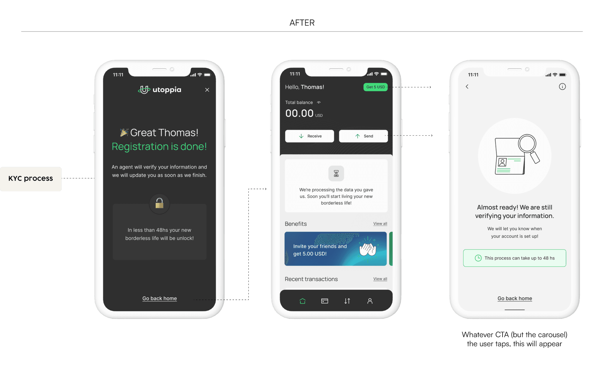
🎨 Redesigning the success screen
We redesign the success screen users see once they finish the KYC to make it more appealing and to make it match our new onboarding.
Also, we added a little bit of gamification, telling the user that their new borderless life was about to be unlock, making them feel they will have Access to a new cool life.
Additionally, we refined our copies to reassure users that we would notify them as soon as their account was approved.
⭐️ Benefits carousel
When the user goes back to the home screen, it was empty with lots of CTA disabled because the only thing they could do is wait. Here is were we took advantage of the down time and added a benefits carousel showcasing everything the user will be able to do once the account got approved.
This carousel showcased everything users would be able to do once their account was approved. Not only did this educate users about the app's features, but it also instilled motivation, encouraging them to eagerly await approval and start using the app.
Eager users, accounts approved, and now what?
So we were already knocking out 3/4 of our onboarding issues: registrations, eager users and accounts approved 🥊. But what did we do to motivate them activate the account?
The Big CTA
Not only the user was receiving a notification when the account got approved, but we were greeting them again with The Big CTA in our home. If the question is “Cool, now what?” We had a huge button for you to tap and see.
With this, we took advantage of our new cool onboarding and did a short one for when the user is at this step.
Answering What and How
The first step to activate the account is to receive USD. Might be obvious, might not be obvious but we needed to make this point clear as well as that they can receive without any fees (awesome, right?). So we know What to do, but How?
Considering our user personas (briefly mentioned in this case study), we understood that we had four distinct categories of users, each with a different flow that we had already mapped out. So we knew they would receive USD in Utoppia from different platforms and that we wanted to have a short message in the screen. Also, we needed to highlight that it was free to receive USD from those platforms, so we could motivate them even more to bring their money to our app.
Welcome sneaky logos
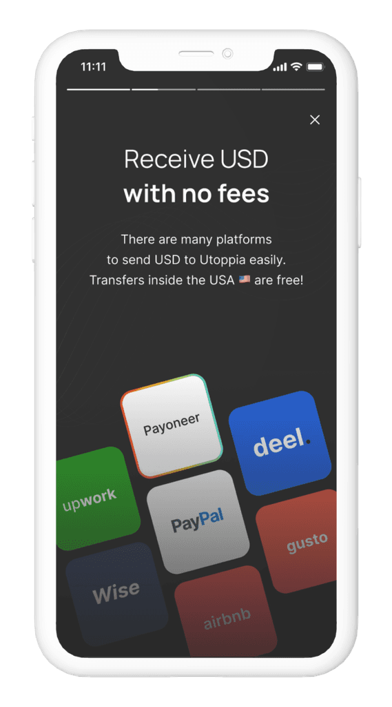
Instead of listing the platforms from which users could receive USD, we wanted to make it more visual so they will quickly identify the one they were using.
For this, we took the most used ones based on our data (thank you data team) and design what we called “the no-logos”.
Due to legal constraints, we were unable to use the actual logos of these companies. However, we found a creative solution by designing visuals that closely resembled the logos, making them easily recognizable to users.
This approach ensured compliance while still providing a design that will be obvious to the user’s eye.
Building trust
I think I’ll never be able to write a case study about a fintech app without writing about the trust issue. Even though I’m repeating myself, it is a big issue as we are talking about money. You wouldn’t trust whoever with your money right?
Here comes Gamification
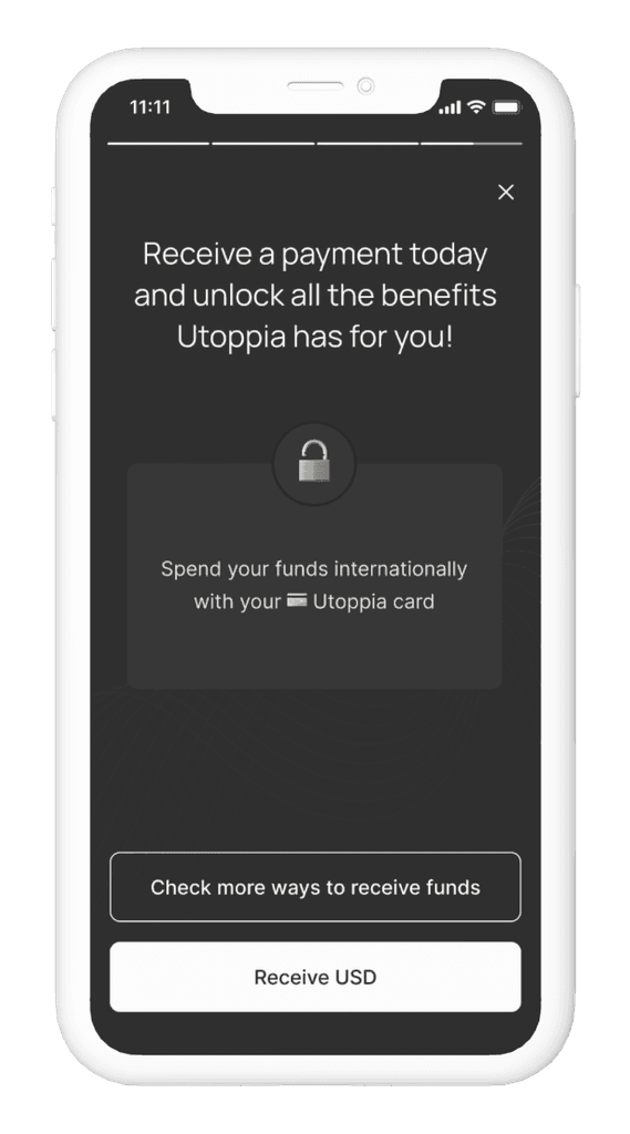
Like we knew from the start, we wanted to continue adding gamification to the app. If we recap the gamification aspects of the whole onboarding flow, we had the approach of the Access feeling by unlocking different levels of the app like their new borderless life.
In this instance, receiving USD marks the initial step towards utilizing the account, and we capitalized on this opportunity to inform users that it's also the key to unlocking the next level of accessing the debit card.
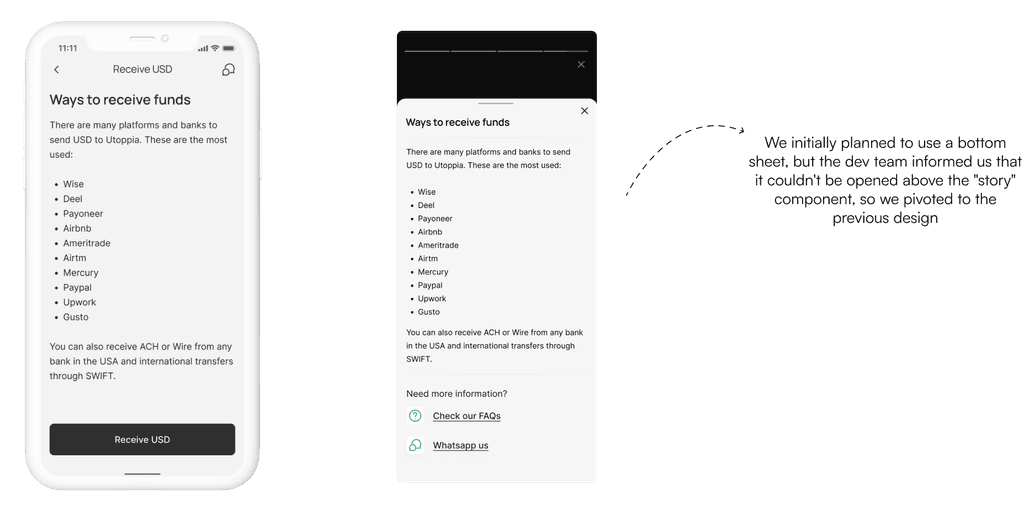
The CTAs will redirect the user to the Receive USD screen or to a help screen where we rewind to the “How” question.
The CTAs will redirect the user to the Receive USD screen or to a help screen where we rewind to the “How” question.
Reflecting on the Journey
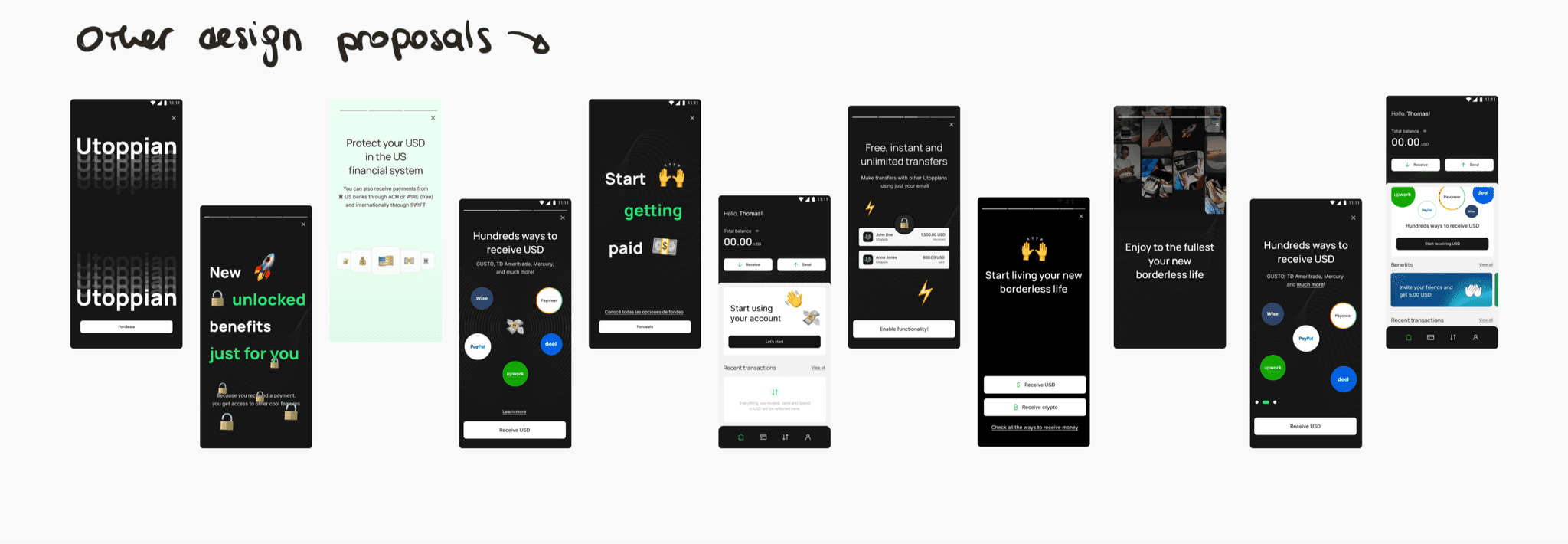
And there you have it—our journey from tackling registrations without activation to creating an engaging activation flow. While we may not have quantifiable metrics to showcase the direct impact so far, our efforts were guided by user feedback and industry best practices.
The one thing that I can say is that after user interviews, 50% of those users activated their account. Our hypothesis is that getting the chance to talk with the real people who’s behind the app made them trust the app and therefore activate their account.
Throughout this project, we encountered challenges, brainstormed innovative solutions, and iteratively refined our approach. The collaborative effort between the UX team, development, and data analysis was crucial in bringing these enhancements to fruition.
