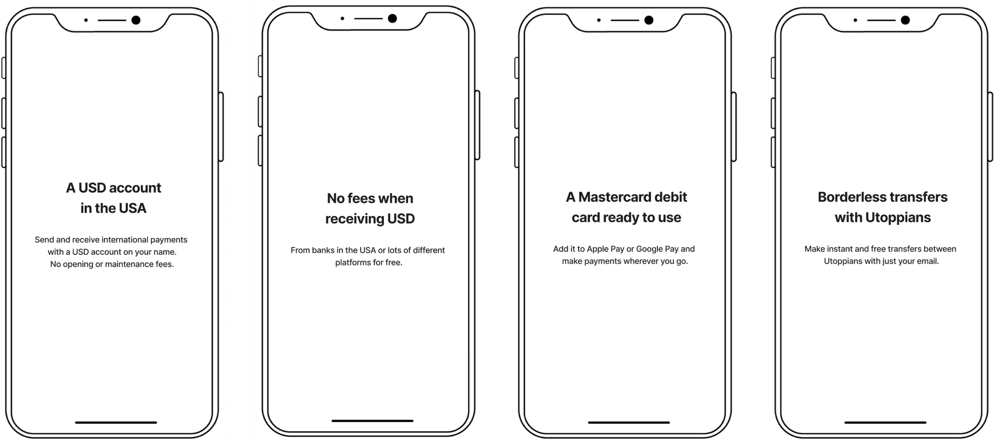
From Downloads
to Registrations
A journey to boost app registrations
Intro
Embark on a journey through the redesign of Utoppia's onboarding process, addressing key challenges and implementing innovative solutions. Discover how the old-but-goodie discovery research and gamification became the secret sauce, enticing users from the very beginning.
I was part of the UX/UI Design team for this project, in collaboration with our Design Lead, Juan Falabella.
The problems
Since the draft and beta versions of the design, the onboarding walkthrough for users before registration has remained unchanged. Here are the key problems with the current experience:
Problem #1
Downloads without registrations
One data point that caught our attention was that people were downloading the app without registering. The registration rate was at 40%, whereas it needed to be at 80%.
Our hypothesis is that users were curious about the app but failed to see sufficient value to proceed with registration, resulting in drop-offs at this stage.
Problem #2
No value proposition founded
Our value proposition evolved from the beta version, yet the same message was retained. Meanwhile, new competitors emerged in the process and we were not showing what makes Utoppia different and better.
Utoppia offers more than just a USA account, and this wasn't clearly communicated during onboarding.
Problem #3
One condition that felt like a door slam
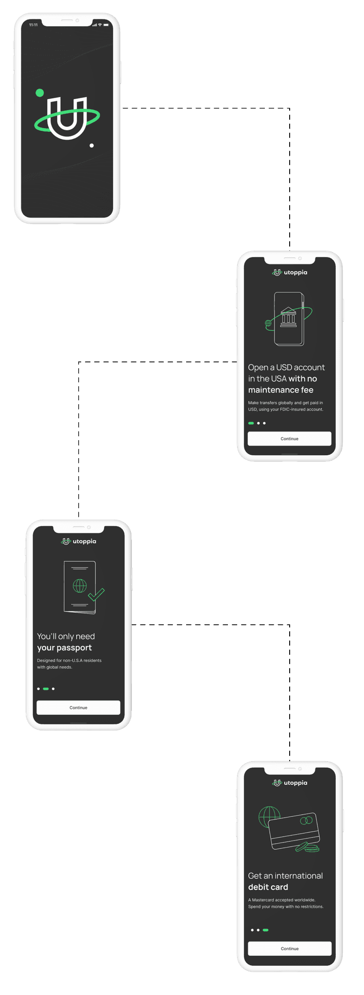
It is true that for being able to have a Utoppia account you need to have a valid passport, but after you read the first screen and got a little excited about it, we were slamming a huge door into your face saying that you need a passport.
“You’ll only need a passport” may sound like a benefit, suggesting it's the sole requirement, but maybe its not something we should highlight in a 32px Title. Why? Our hypothesis is that users might abandon the registration process at this point.
You may wonder if this is similar to encountering the passport requirement during registration, but for a more in-depth exploration, we've got you covered here.
Problem #4
No benefits, hence no motivation founded either
While we highlighted some features, we overlooked other essential benefits crucial for motivating users to complete the onboarding process.
What about other types of fees? What about transfers? How can I fund this account? And some other questions we got from Research are examples of the wanted answers before committing to registering on the app.
Business goals
Our primary business goals were:
📈 Increase the registration rate: The registration rate was at 40%, whereas it needed to be at 80%.
💎 Enhance communication of Utoppia’s value proposition: Clearly communicate the expanded value proposition beyond just the USA account and the card.
Given these goals, we asked ourselves:
How might we use our research findings to improve the onboarding process and achieve an 80% registration rate?
The solution
Even though it’s crucial to invest in publicity, websites, social media accounts and other promotional aspects, during a product launch, one of the most impactful places to clearly display your value proposition is within the onboarding walkthrough.
In just a few screens, you can either get the impact of lots of people converting to users or lots of people dropping and not registering. To address this, we focused on refining the copies, UI, and the sequence of presenting benefits. We revisited previous discovery research to understand user needs and collaborated with stakeholders to reassess our mission, value proposition, and brand message.
If you were to ask about our definition of success, it would be an increase in the registration rate, and we are happy to say that we have achieved this goal.
Before
40% registration rate
After
81% registration rate
Early ideation
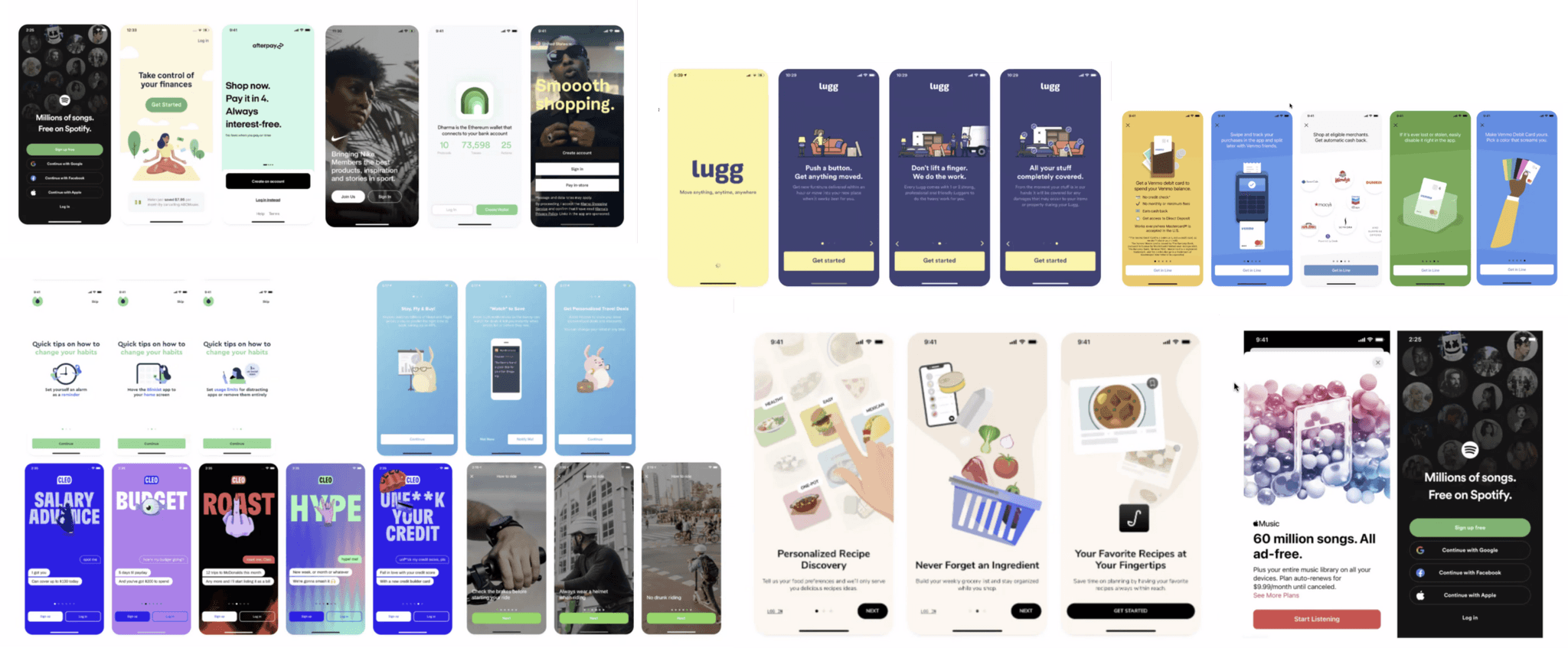
We kicked off this project doing lots of benchmark of onboarding walkthrough to understand what are the key elements we need to display in it. Our analysis extended beyond the industry so we could have a broader understanding of it:
Here’s what we learned:
👋
Splash screen, Welcome/Get started & Walkthrough
Some companies only have a Welcome / Get Started screen while others (most of them) included both the walkthrough and Get Started screen. In addition, many incorporated a splash screen with some sort of animation visible from the first app launch.
💎
Walkthrough = value proposition
Without a doubt, the app walkthrough needs to display the product’s value proposition. We needed to empathize with our user and ask ourselves: what do users gain with OUR product?
✏️
Lots of editing is coming
Some companies are nailing the way they communicate their value propositions and benefits. While researching, we saw that some of them changed the walkthrough numerous of times editing the message multiple times. Thus, we understood the importance of extensive editing, compelling us to carefully consider what makes our product unique.
🖼️
Dont forget about the image
The graphical elements, whether illustrations or photos, should be as thoughtfully designed and edited as the copy itself. The goal is not to fill the space but to enable the user to understand whats the screen about just at a glance.
With these insights, we started working on our message.
The first thing we did was to check our website, we took screenshots of everything we saw we were communicating as a value proposition. However, in the middle of this task, we reminded ourselves of our personas.
How the discovery research played a huge role
To improve the walkthrough of our app, we were on a tight deadline. However, we have done lots of discovery research in the past which came super handy for this task. Based on our previous research made in +4 countries, we categorize our users in 4 categories.
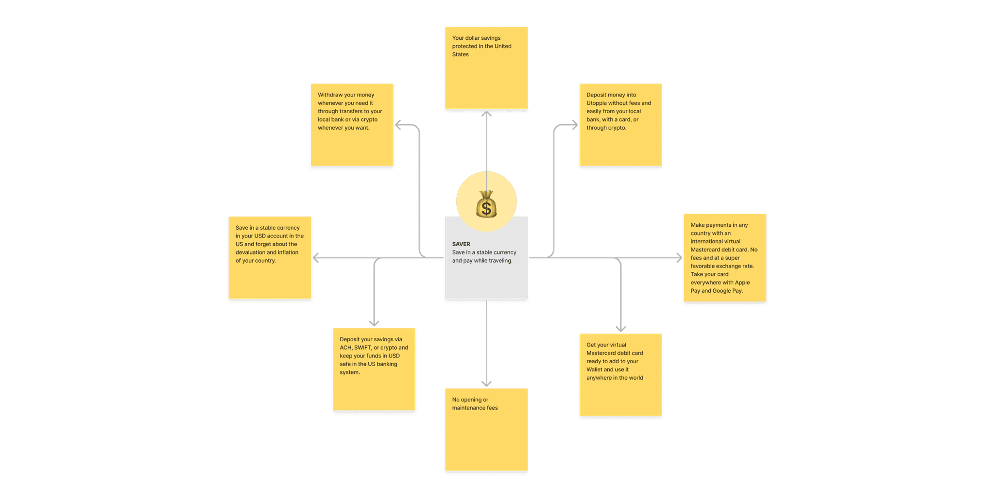
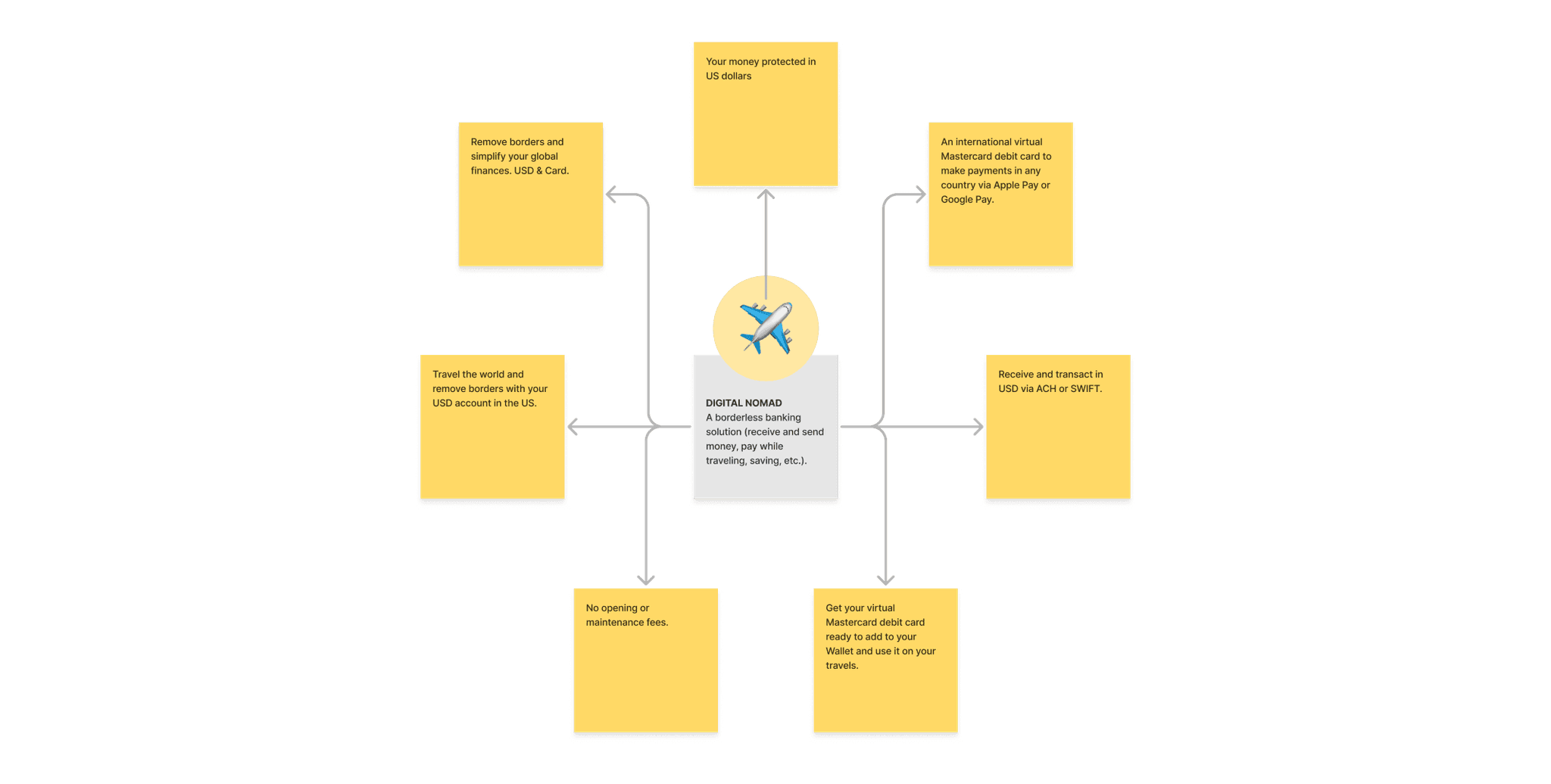
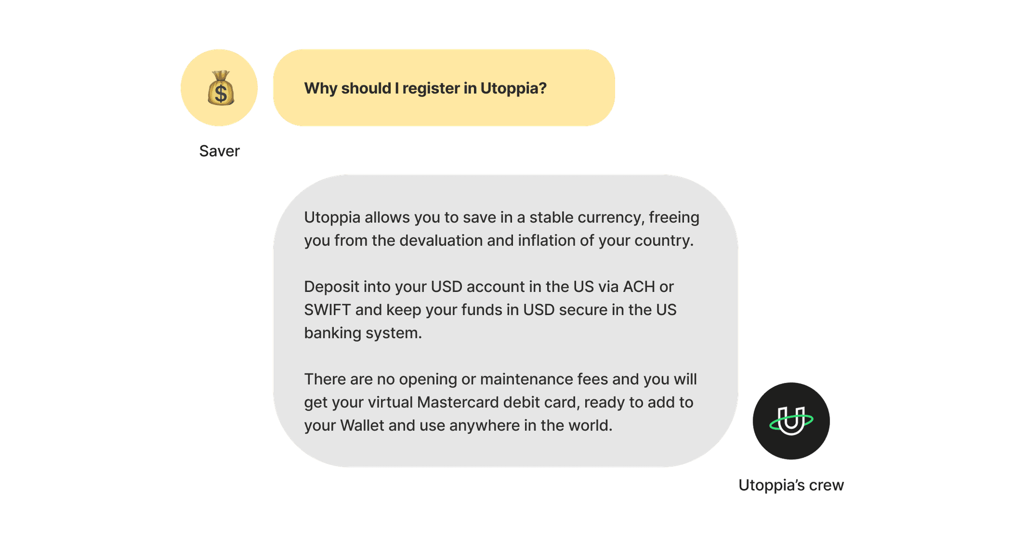
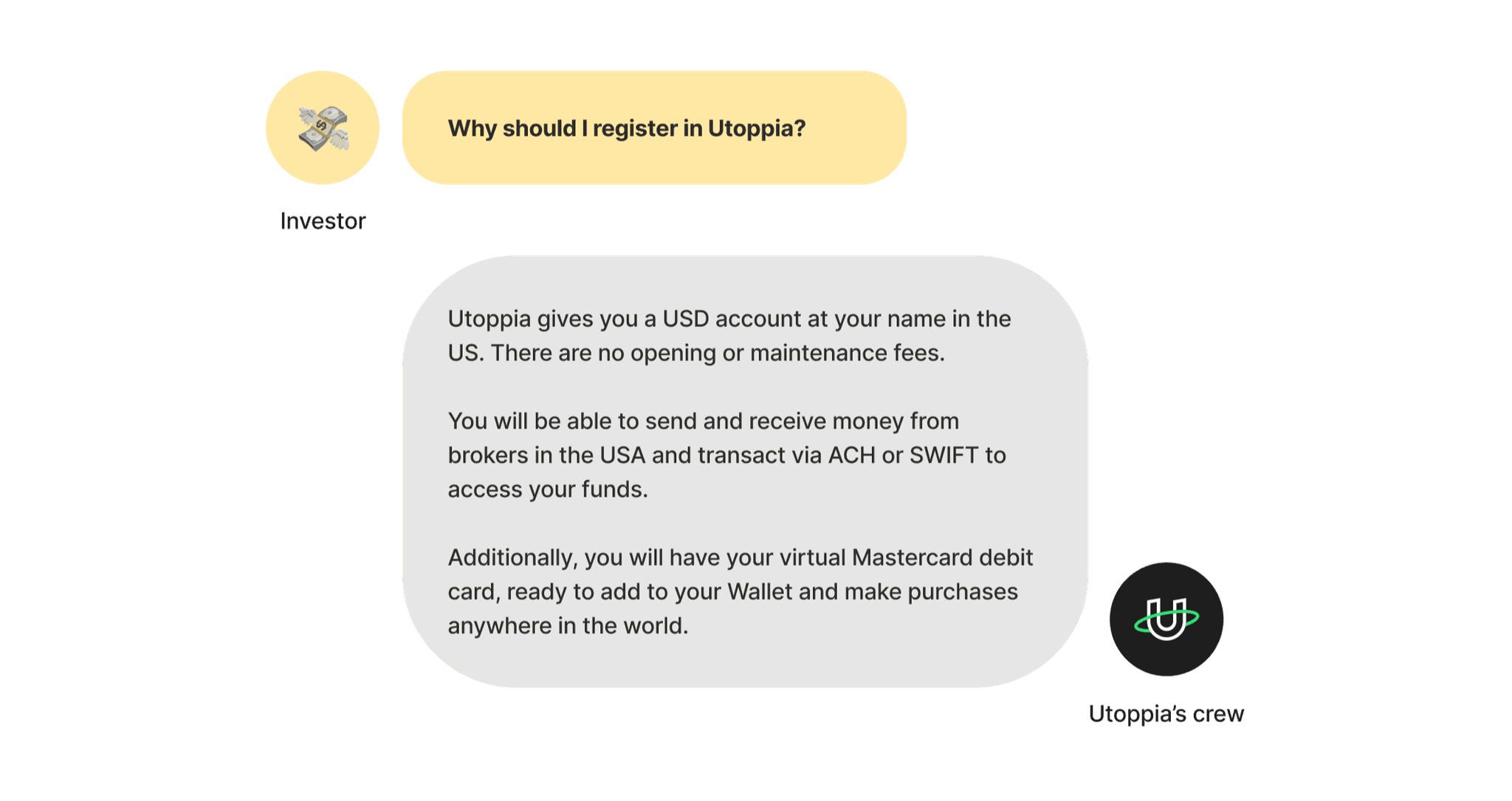
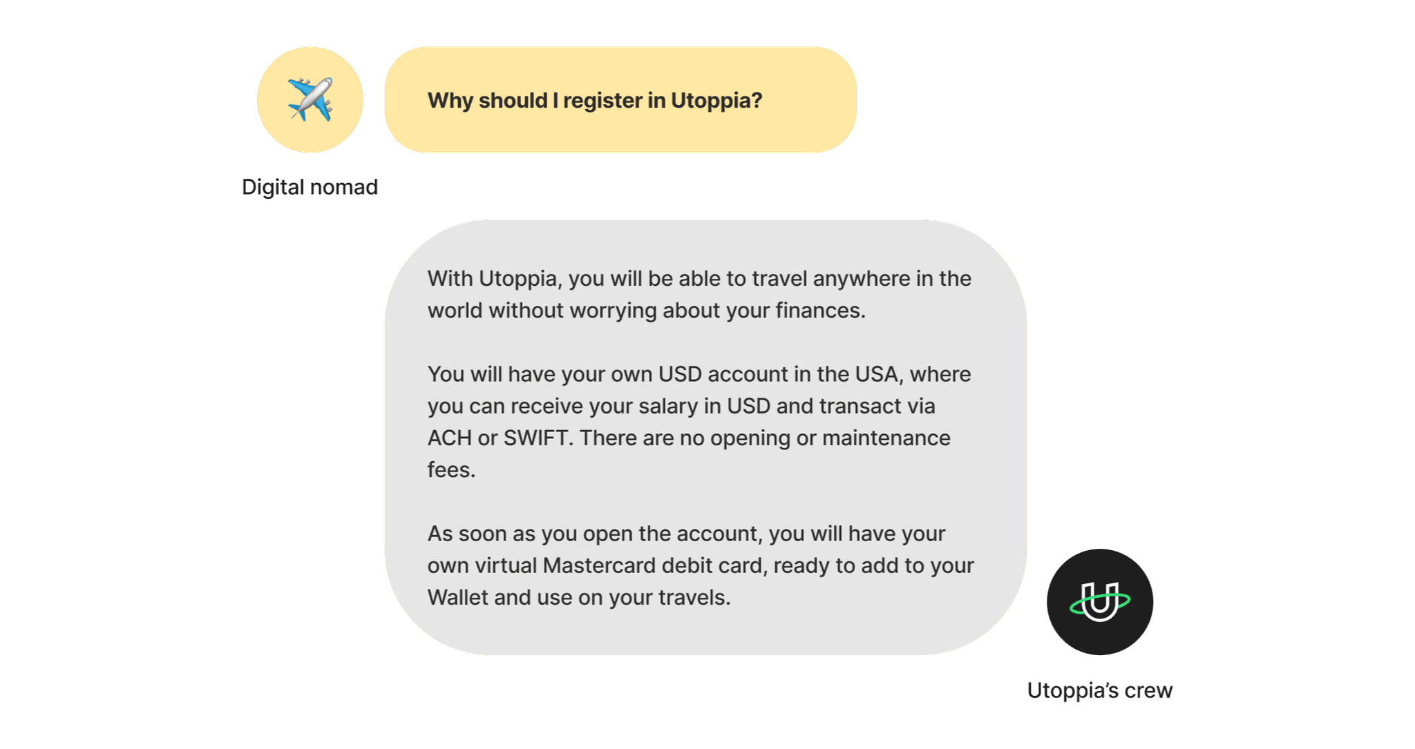
For each of them, we had lots of information about what they need, want, their frustrations, goals, etc. So we thought, lets summarize in 1 sentence what’s the need for each of the categories:
🧑💻
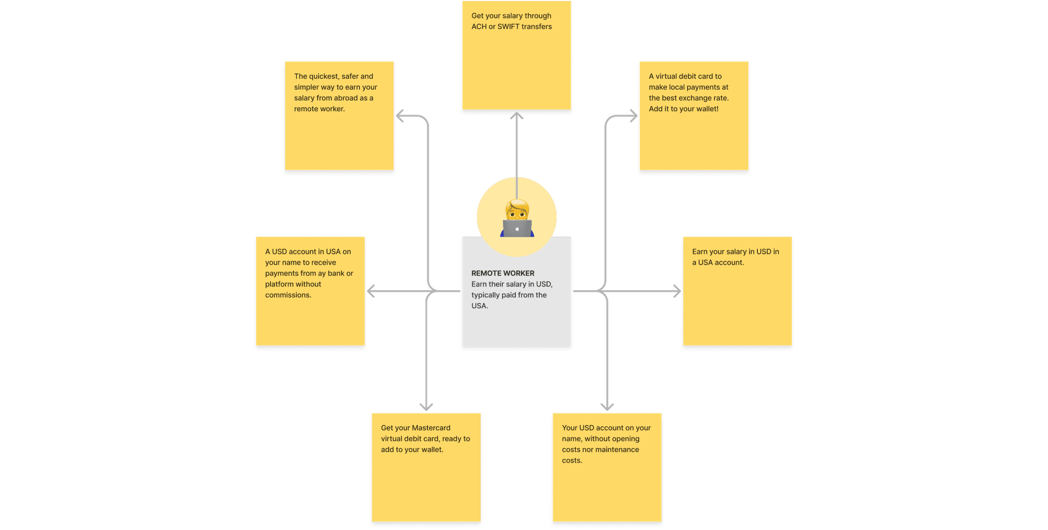
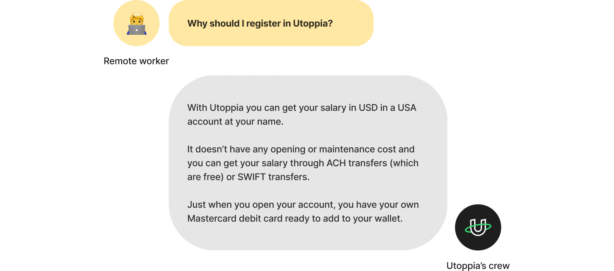
Remote worker
Earn their salary in USD, typically paid from the USA.
🎨
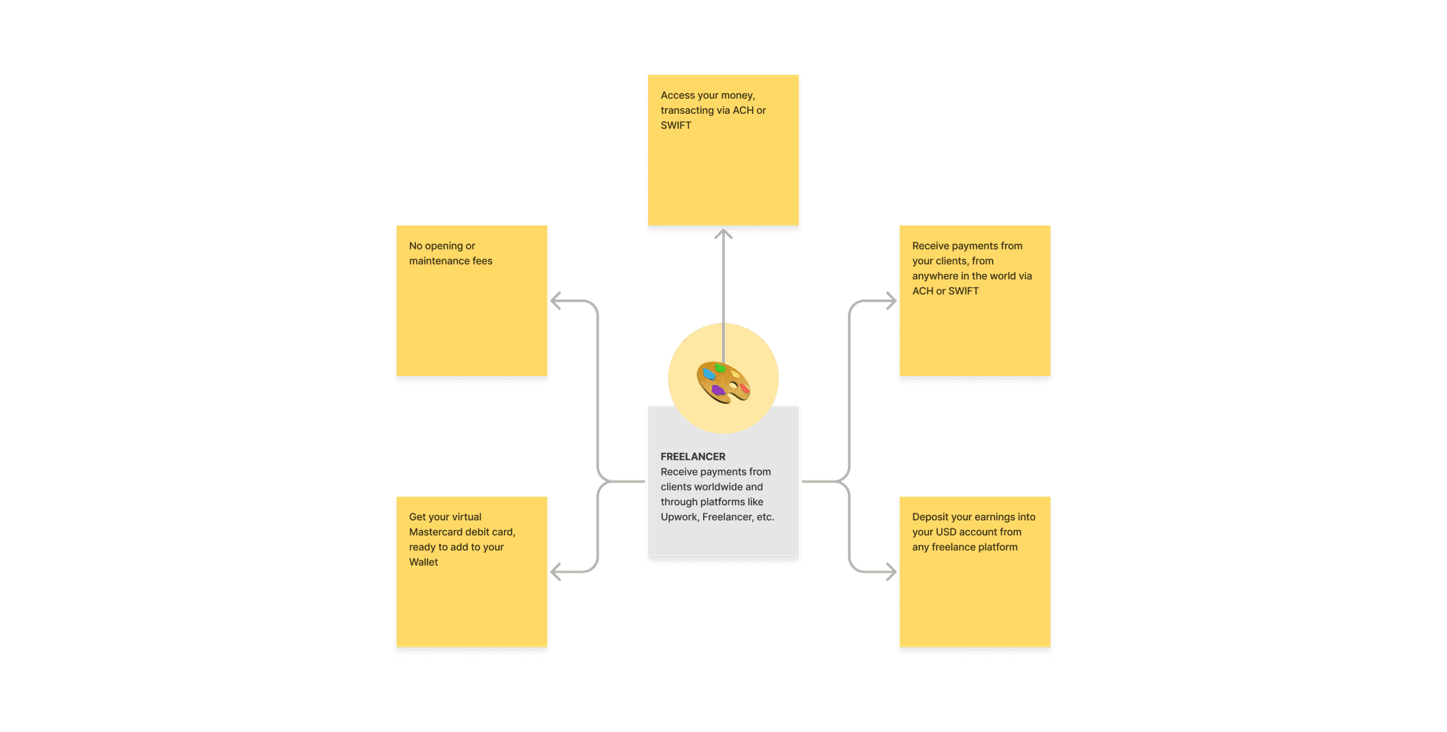
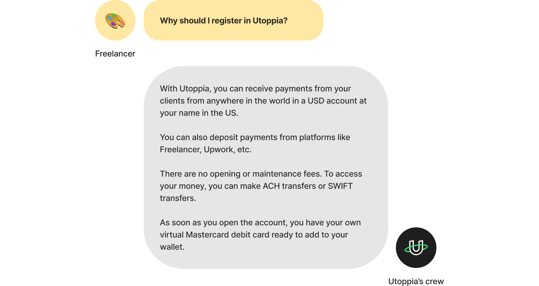
Freelancer
Receive payments from clients worldwide and through platforms like Upwork, Freelancer, etc.
💰
Saver
Save in a stable currency and pay while traveling.
💸
Investor
Send and receive money from investment brokers in the USA.
✈️
Digital nomad
A borderless banking solution (receive and send money, pay while traveling, saving, etc.).
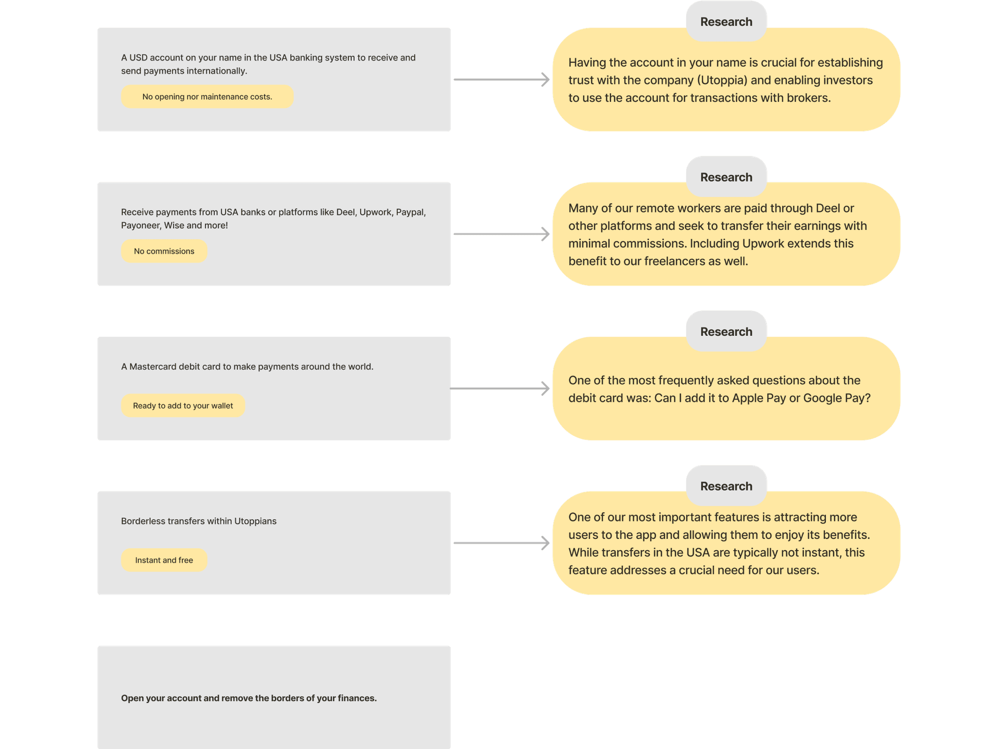
Once we reminded ourselves the needs of each of our users, we began grouping the communication of our website and the features we knew were crucial for addressing these needs.
As you can see, many features were repetitive and we needed to group this even more. Thus, we adopted a conversational approach, imagining we were chatting with each user category as if they were our friends. In this scenario, if they ask us about Utoppia, what would we say?
We continue refining and consolidating the messages with the goal to craft concise yet powerful messages, complemented by brief tags that would provide additional context about the specific content highlighted on each screen.
Proud of our progress, we decided to start working on the UI. Guess what? We found ourselves revisiting and refining the copies once more.
Not so fast, my friend
When we went to work on the UI, we realized that we had space to have a short but impactful title, a short but impactful description and a good graphic to tie everything together seamlessly. We knew that:
- The first screen should clearly communicate the app's purpose and our primary offer, straightforward.
- We needed to talk about receiving money/salary/payments: what are the commissions, from where they can receive it?
- We wanted the user to know that they will have a free Mastercard debit card and that they can pay using their wallet.
- We needed to showcase our P2P feature and what will the user benefit from it.
UI o’clock
From the early ideation benchmark we learnt that lots of editing was coming, and boy we did that. But now, it was time to move on to the UI.
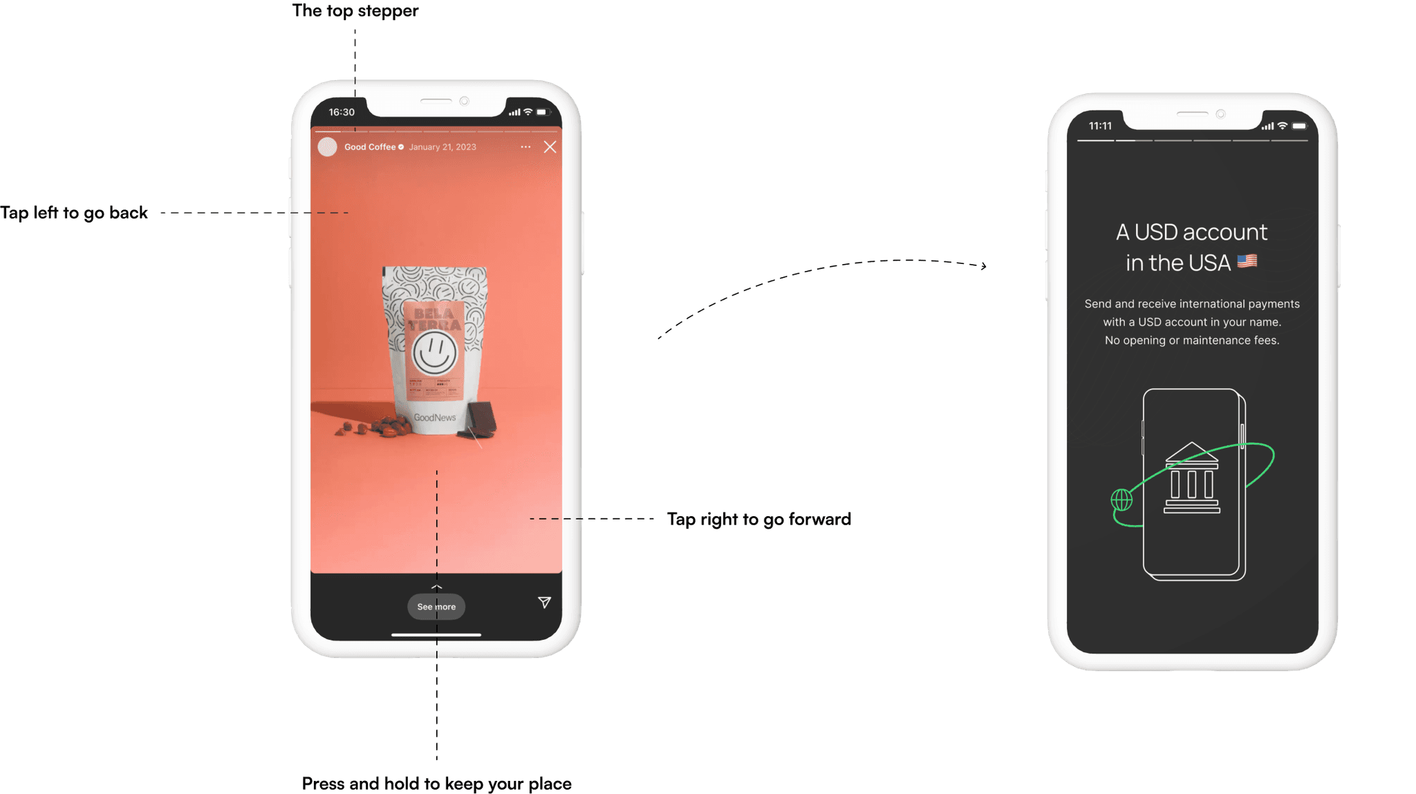
One of the things that was really trendy at the moment, were walkthroughs designed as Instagram stories. We believe people are familiar to seeing stories, they know that if they see the stepper on top, it will function the same way IG stories do. We made sure the dev team was able to achieve it and decided to move on with that component.
What about the graphics?
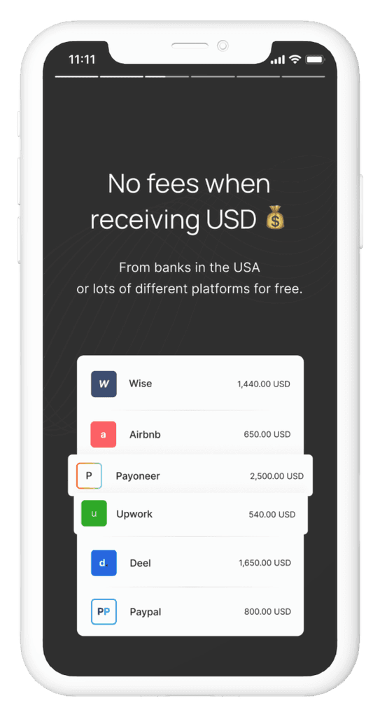
3/4 of the illustrations we used we already had made by our illustrators, but the one that I’m really proud of is the graphic of the second screen. If you've noticed, we intentionally omitted the names of platforms used by our users to receive salaries or payments (remote workers, freelancers, investors) from the second to last copy draft. That was a decision we made when we realized we were able to tell it in the graphic itself, making it more obvious and straightforward.
When deciding which platforms to include, we examined user data to identify the most commonly used ones, creating a message that resonates with all our personas. In addition, we took into account Miller’s Law that the average person can remember only 7 items in their memory.
Not so fast, my friend v.II
An unexpected challenge happened when we were taught about the legal aspects of using other companies’ logos. The initial draft featured the actual logos, which our Legal Team was not that happy about. Once we learnt what we could and couldn’t do, we did it by not using logos or fonts, but ensuring the representation was unmistakable, allowing users to understand the referenced brands without infringing anything.
From start to end
We knew that we wanted to avoid having lots of screens, so we decided 4 was the right number for our value proposition walkthrough. However, we wanted to start with a very impactful message and end strongly as well.
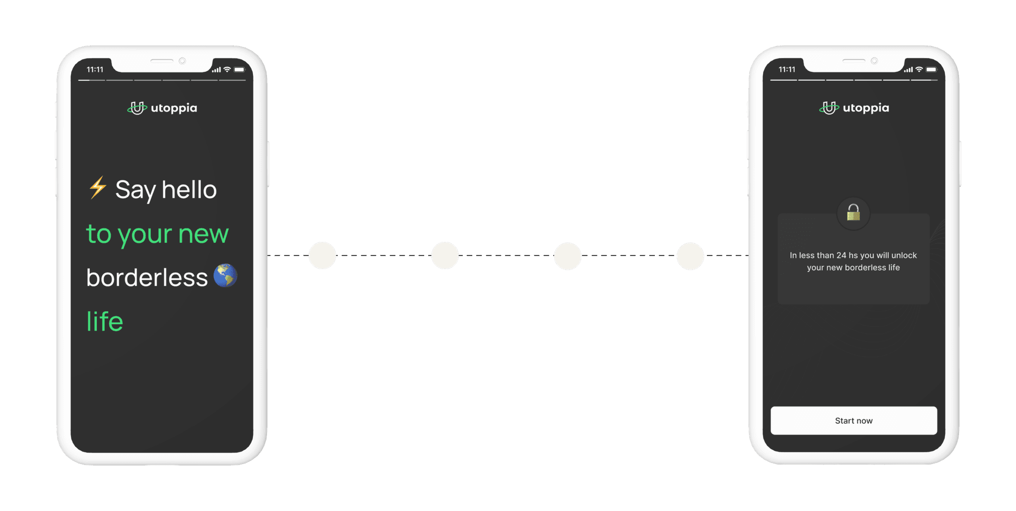
Our first screen became a welcome to our potential users and our last one, a gamification ingredient.
The role of gamification
We were already planing to have a Premium Plan in the App, which was going to be great for using gamification: it will give the user a new Status, a new Access, Power to customize some features and Stuff, lots a Stuff. But what if we start the gamification at the beginning of the user experience? This was a new door that was opening for us: we realized we could start using gamification from the very beginning to motivate our users to do stuff, in this case, to make the user want to Access this new borderless life.
As users unlock this new way of life, a cascade of additional features and access points becomes available, creating an ongoing journey of exploration and engagement.
Results & learnings
After intensive work refining, editing, and curating our message, we successfully agreed on our Value Proposition and integrated it into our new onboarding walkthrough. As a result, our registration rate improved significantly, going from 40% to 81%.
- Continuous Improvement: We will keep iterating and enhancing our onboarding process, continuously testing and refining our copies as we introduce additional features to our app.
- Illustration Enhancements: Collaborate with our illustrators to explore new illustrations, ensuring they align with the updated onboarding experience and avoid repetition.
With this project I had 2 major learnings:
1. Do research when you can, go back to it all the time: we all know that sometimes we dont have the time to interview our users for each of the projects or challenges we face, however, doing research (specially interviews) when you can will help you out not only for that particular research objective but for many more problems to come. If you take the time to analyze each interview, grab data, group it and organize it, it will become super handy to go back, read and help you figure out some solutions lots of times.
2. Edit, edit, take a break, read it again, edit one more time: have you ever heard of being burnout? of course you did. When you feel that you cant edit or improve something anymore, its time for a break. This is for copies, designing UIs, analyzing research, etc. Stepping away and returning with fresh eyes can make it easier to identify areas that need refinement or enhancement.
Bonus track: there’s always room for improvement. Every project, no matter how focused, often uncovers additional areas for improvement. In this particular case, addressing one aspect of the onboarding process led to the realization that further enhancements were needed for users who completed registration but showed minimal activity. This means we needed to start working on it, understand what was happening and continue motivating our users to use the app. Want to know what happened with this? Check it out here.

